
Visuals are your chance to showcase your products and tell your brand’s story. So, what better way to capture shoppers’ attention than strategically using product photos and color to evoke the right mood and emotions—and ultimately make shoppers want to buy your products?
Receive free ecommerce & product photography tips
Color can take an otherwise ordinary-looking product and make it pop off the page. Not only that, you can create a cohesive brand your shoppers will become familiar with.
Understanding color’s role in ecommerce allows you to make the right decisions for your shoot, but how can you choose the right background for your product photos? That depends on a variety of factors.
How to choose the best background color for product photography
- Figure out where you’re using the photos
- Consider the color of your product
- Think about other subjects in the photo
- Use color to evoke specific emotions
- Complement your brand colors
- Review your photos on different devices
1. Figure out where you’re using the photos
Your product photos need to look great on your own website, but you also need to consider the context of your photos for other placements, such as online marketplaces, social media, and brochures. Let’s look at the best background colors for each channel.
Your ecommerce store
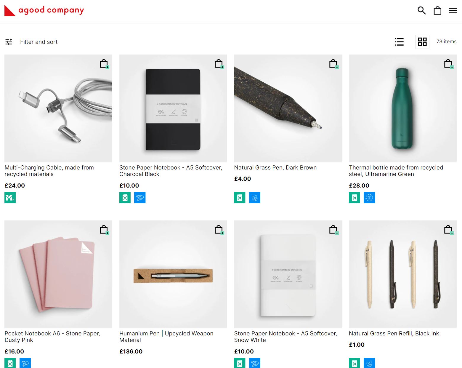
White, transparent, slightly off-white, and light gray are popular background colors for most ecommerce websites. These clean backgrounds make it easy for shoppers to browse through your products. Instead of being distracted by too much color, they can focus on and compare the products, like on Agood Company’s online store.
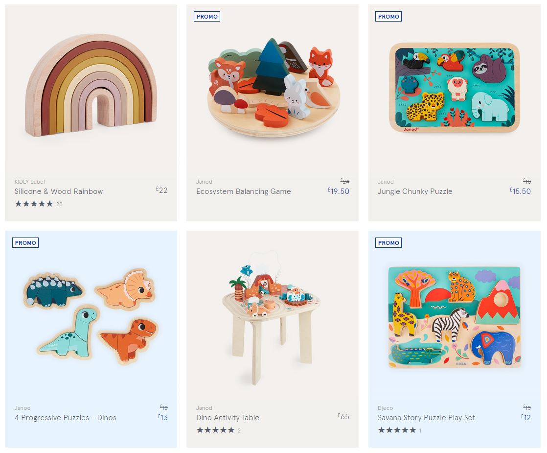
If you want to use a touch of color, make sure the tones work well across your website. For example, children’s product retailer Kidly opts for different neutrals that fit well together and suit the brand’s light color scheme.
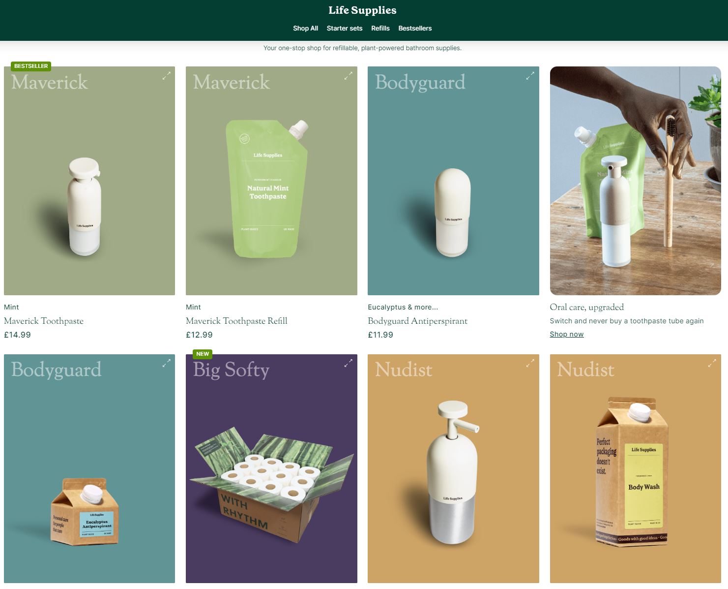
If your brand calls for bright colors and you want a unique ecommerce shop front, get inspired by Life Supplies, which uses different tones to separate its various product ranges visually. One quick glance and shoppers instantly know which products are from the same line.
Social media
When people look at your social media channels, you want them to see some visual connection between your images and your overall brand identity.
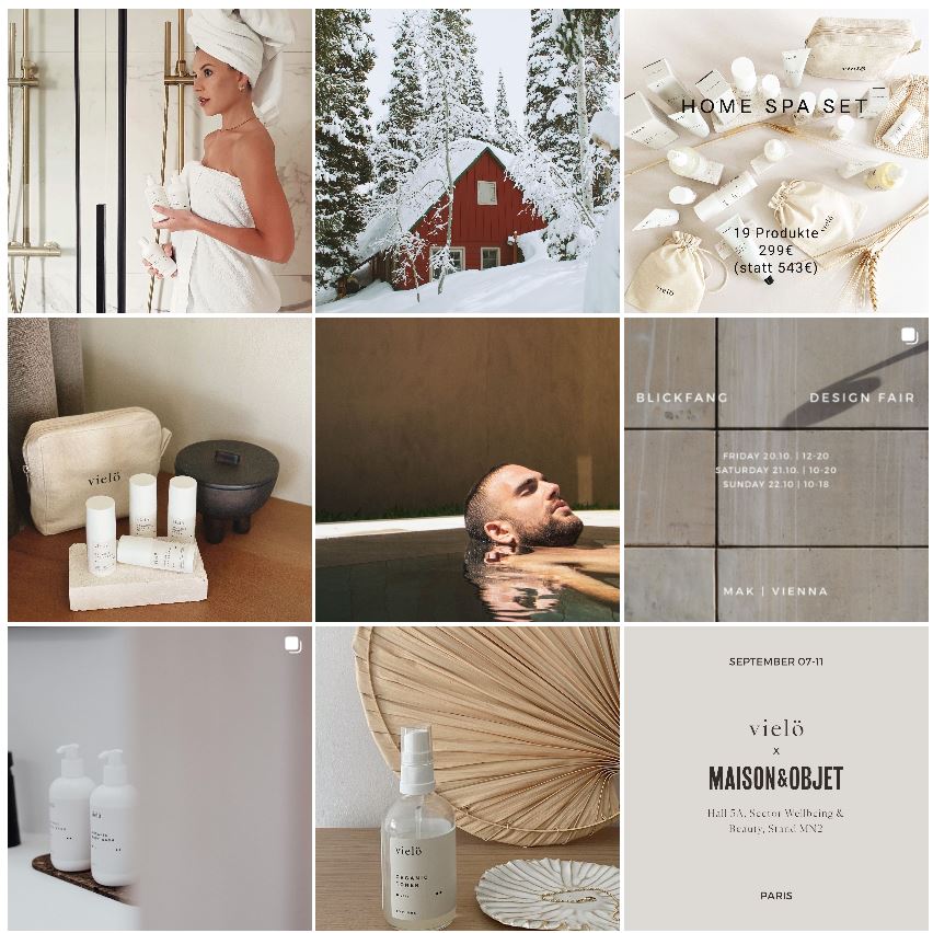
For example, Vielö sells premium skincare focused on organic and sustainable ingredients. The brand’s Instagram page shows photos featuring neutral colors and tactile materials, such as wood, paper, stone, and others. No photo is the same, but they all work together in a collection.
You can also experiment with more colorful backgrounds, cropping, and filters for social media. It all depends on your brand and audience.
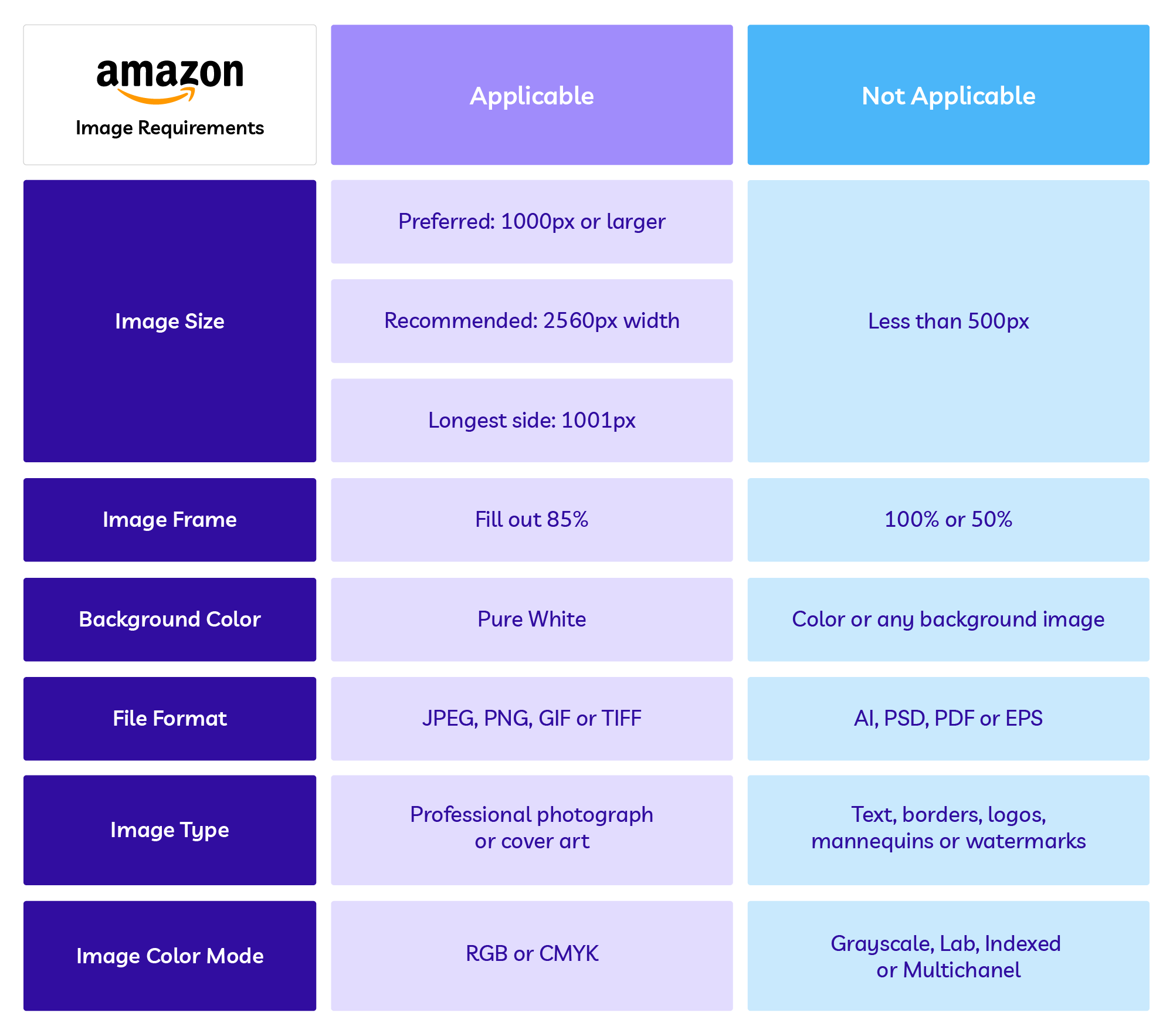
Amazon
Amazon requires sellers to use a pure white background for product photos. Even if you didn’t use a white background at the time of shooting, you can add it during post-processing.

Here are other requirements to keep in mind for Amazon:
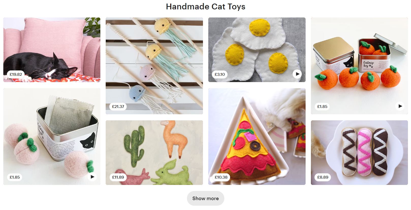
Etsy, eBay, and other marketplaces
While other platforms aren’t as strict on having a white background, it’s still recommended for marketplaces like Etsy and eBay. It brings uniformity to the product browsing experience and makes your products look professional.
However, Etsy, for example, also allows you to use brighter colors and lifestyle settings as product backdrops. Browsing the different Etsy gift collections shows how sellers use various backgrounds.
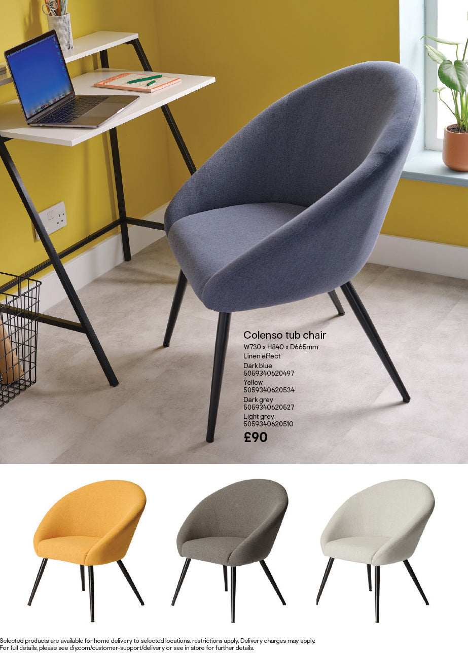
Print signage, catalogs, and brochures haven’t gone anywhere. They’re still essential parts of marketing campaigns for many brands.
Clean white background is the perfect canvas for showing your product’s features and colors, while contextual lifestyle shots will allow shoppers to envision how they may use your product. For example, DIY and home improvement retailer B&Q uses both across its brochures.
If you need to use product photos for in-store displays and signage, contextual lifestyle backgrounds tend to reign supreme.

2. Consider the color of your product
Product color is another consideration when deciding your background color. The main thing to remember is you need contrast between your product and the background color. This means your product should always be lighter or darker than the background, regardless of your chosen tones.
Bright, colorful products
If you’re not limited to specific background colors, like white for an Amazon listing, and want to add color to your products, why not experiment with vibrant hues?
Once you know which products you need to photograph, review your shot list and look at the main product colors. Then, using the color wheel, review the opposite colors on the spectrum—these shades will let your products stand out.
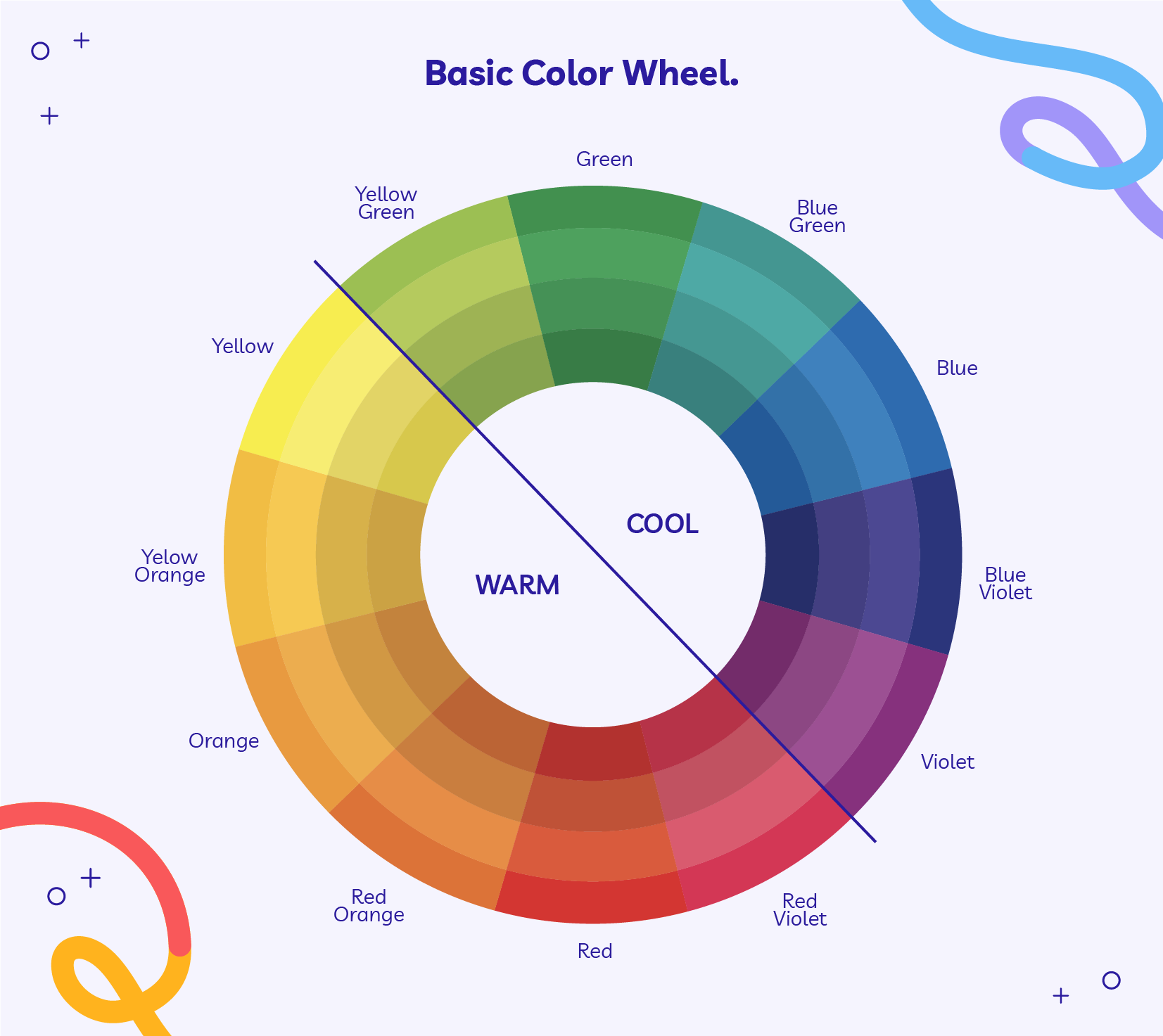
For example, if you have a green-colored product like this cleansing bar by Ambi, you’ll find reds, pinks, and violets on the opposite side of the color wheel. Using one of those as a background color for your product is a simple trick to create instantly eye-catching and attractive visuals.

You’re not limited to just indoor studio shots, either. Take this purple wine bottle and tumbler from Partner in Wine as an example. While the overall shot features similar lilac tones, the product is displayed against the contrasting green grass, leading the eye straight to the product.

Similarly, if your product has warm tones, opt for a cool color as the background—and the opposite for products with cool tones.
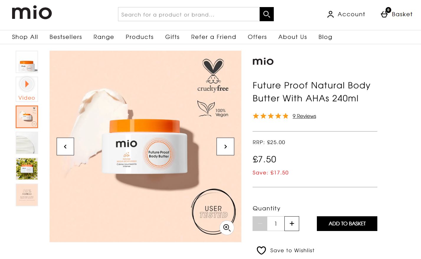
If your product only features a hint of color, try that as a background option. But, instead of going for the exact same shade, tone it down and opt for a lighter one, like Mio’s body butter photo.
One trick is to use an online color tool like HTML Color Codes first to find your product accent color and then move the slider to the left for a lighter shade you can use as the background.
Neutral products
If your products are in the neutral tone range, why not stay there? Gray, nude, beige, and other neutral shades lend themselves equally as calm background colors for a sophisticated look. That’s not to say you can’t add a splash of color if it fits your brand, but neutrals work particularly well with equally neutral background colors and organic backdrops like stone, sand, wood, linen, and other materials.
Ethical and eco-friendly lifestyle brand Nkuku shows how adding similar neutral colors in the background can create an earthy but elegant look. The trick is to add enough color contrast to let the product take center stage.

White objects
If you sell white products and need a white background to fit the requirements of a marketplace like Amazon, ensure your lighting and editing emphasize any shadows or texture the product might have. Doing so will help the product stand out even on a white or off-white background, like the Amazon listings for white gloves.

If your white background shots need a touch of luxury, add a reflection shadow, just like Lily & Roo’s pearl necklace shot. It gives the illusion of a glossy surface, often used in higher-end jewelry, accessories, and tech stores.

However, If you have the creative freedom to pick a background, any darker colors will help your white product pop. There is no one-size-fits-all, and instead, consider your brand’s color palette to help you choose a few different tones to find the best color background for your product, like this rich, maroon fabric showcasing high-end jewelry from Prestons.

Transparent products
What if your products have no color and are made of a transparent material like glass? Whether you choose a white or dark background, lighting your product to bring out its edges is key. Adding shadows will help separate your products from the background, just like Waterdrop’s shots of clear glasses on a white backdrop.

Another option is to add a subtle gradient. Nkuku’s glass bottles demonstrate it well—the lighter shade on the left highlights both bottles on one side, while the darker side contrasts the bottles’ contour on the right.

Black products
Photographing black products brings its own challenges, similar to white and transparent. You want the product to be distinguishable from the background without losing any of its unique features.
Generally, this means you’ll want to go for a lighter color background. But you don’t have to always stick with white. Try more powerful colors, like Ethique did with its charcoal soap bar against a bright pink backdrop.

On the other hand, dark backgrounds can create a luxurious, opulent feel, so if your brand calls for a dark design, go for it. You’ll just have to pay attention to your lighting during the photoshoot to illuminate your product and its shape, like in this bracelet product shot by Seekers.

Whatever background color you choose, you want shoppers to see your products clearly. If the background overshadows the product or makes it difficult to see, that’s a clear sign to try something different.
Finding the right balance comes down to experimentation. Remember, you can always change the background color in post-production or use a color change service if the photo doesn’t turn out how you envisioned.
3. Think about other subjects in the photo
While product color has perhaps the largest impact on which color background you should use, you might also have other subjects in the frame to consider.
Props
If you create lifestyle or styled product shots, you’ll need props. Same as picking a background color or pattern, choose props that will complement your product rather than distract from it.
You might want to decorate the shot with props highlighting your brand’s message. For example, independent organic skincare brand Harvest included cozy wool socks, a towel, and a rustic wood backdrop in its foot salve product shot. The brand focuses on natural ingredients, hand-crafted products, and simple packaging, which shows in its prop choice.

Another method is including natural ingredients as your props if you sell health, beauty, food, or drink products. Ethique does this playfully with bright colors and unique prop placement for its body care collection. Each photo features the main product ingredients, such as a slice of lime with ginger or a spoonful of matcha.

Models
Showing your products in use with the help of models is a great way to give shoppers more context about your product. For clothing, footwear, accessories and jewelry, it’s a traditional way of showing how the product looks when worn, like on the Wild Fawn Jewelry online store. But you can use models for other types of products, too.

Spend time with your team and photographer, and consider how your model’s hairstyle, clothing, and skin tone work with your background color to make your products shine. Establish who your models are in advance and which background colors you hope to use. Working with a stylist can also help ensure your models and products complement one another.
Remember, models play an important role in highlighting your products. But in most cases, they shouldn’t be the main focus. For example, WILD SAGE + Co included a model for its beeswax candle shot, but the model’s pose and clothing don’t detract from the main focus of the image—the product.

4. Use color to evoke specific emotions
When you want to add some color to the background, consider how those colors may affect online shoppers. Are they complementary to the colors of your product and brand? Will they persuade shoppers to buy? Do they resonate with your brand?
Emotions associated with colors will vary across cultures, so it’s not a universal method. But you might still get inspired by traditional color associations as a starting point. For example, blue can invoke feelings of serenity and logic, while green—freshness, health, and nature.
While color is important, the truth is, there’s no best color for background. The colors you choose depend on your goal and what you’re trying to convey.
5. Complement your brand colors
To get the most from your product photos, don’t forget that they need to go well with your brand colors. The last thing you want is to have a handful of quality photos that don’t match your website or brand color theme. This is why planning your shoot beforehand is so important.
6. Review your photos on different devices
With 54% of shoppers choosing online shopping for better value, there are many different types of devices accessing your online store. Even if shoppers are in a physical store, as many as 92% still check out products on their phones first. From computers and tablets to various smartphones—that’s a long list of differently sized gadgets.
First, review how your images look on different screens—are they sized appropriately and visible even on smaller phones? As many as 44% of shoppers are expected to use smartphones in 2025, so ensure quality photos with cropped unnecessary details. Most browsers have built-in emulators to check sites on different screen dimensions.
Second, consider varying screen brightness and contrast levels. This means products need to stand out against busy backgrounds—or those that are too similar to your product tones—without colors blending together.
Product photography background ideas: colors to try
If you’re looking for quick recommendations on picking the right color for your product shots, here are some tips and creative background ideas:
White
White is the most common background color for online listings by default, and for a good reason. It works well with most color combinations and doesn't require heavy edits.

White is a safe bet and works for many scenarios:
- Fits online marketplaces: Ecommerce platforms like Amazon require at least one product photo to have a white background. Even if not a requirement, white is the perfect, distraction-free backdrop to show products on any online marketplace.
- Creates a cohesive look: A white background is a great choice if you want a simple, clean look for your online store. With white background, there’s no room for error because all your product backgrounds will work together.
- Makes editing easier: Even if your background looks slightly off-white after photographing it or the backdrop has some wrinkles, it’s easier to edit it to pure white compared to colorful backgrounds.
- Brings attention to the product: Most products will instantly stand out against a white background.
- Gives space for text: If you need to add any words alongside your product, such as for an infographic, a website banner, or an email, white background makes it easy to create a clean design.
- Can decrease page load speed: Adding color to images can increase your file size. White background images, on the other hand, can help your site load faster, but make sure you still compress your photos.
Neutrals
The closest to a standard white background, neutrals like off-white, gray—from light to dark— beige or brown can highlight your products online.

Neutral works well for different product ranges and scenarios because it:
- Fits most products: Neutrals play well with jewelry, clothing, homeware, skincare, beauty products, and even tech.
- Don’t distract from your product: Similar to white, neutral tones will keep the attention on your product.
- Adds subtle warmth or coolness: Beiges and browns will infuse a warm feel to your shots, while cooler neutrals, such as gray or subtle blues, will tone it down.
- Perfect for social media: White might lack personality for branded social media product images. This is where neutrals shine and can help you create aesthetically pleasing social media shots.
Black
If you’re going for a more dramatic, elegant look—look no further than black for the background color.

A black background:
- Creates a luxurious, timeless feel: It’s not very often you’ll find product shots with a solid black background, but it can work well if you’re going for a classic, bold look. The depth of an all-black backdrop gives an air of sophistication, perfect for showcasing jewelry, leather goods, technology gadgets, or rich textiles.
- Brings out product details: Lighter products with interesting textures can benefit from being shown against a black background to focus attention on their details, shape, or other unique characteristics that might otherwise not show on a white background.
- Works well with metallic products: A black background helps show off the shiny, reflective surfaces of metallic products as the light bends around them and creates a mix of highlights and shadows.
Colors
Whether you want high-impact pops of color or soft pastel tones, strategic use of color backdrops can take your photos to the next level.

Here are some ideas on how to use colorful product photo backgrounds:
- Contrasting colors: Use the color wheel to find opposite colors that’ll make your products pop.
- Complementary colors: Layering colors in complementary or similar shades to your product will create a harmonious look. It’s a great way to mix and match your brand palette colors to add something unique to every photo.
- Bright colors: If your brand is all about energy, vibrancy or capturing attention, bright color backgrounds will help you set that tone in your product shots. Just take care not to let the colors detract too much from the product itself.
- Pastels: For a softer, more relaxed aesthetic, try using muted pastels. Shades like powder blue, pale peach, lavender, and subtle mint green can help express warmth and nostalgia. Pastels also tend to work well with floral, feminine, or vintage-style products.
Natural materials
Want something more unique than just a solid background color? Natural materials can help you create eye-catching product shots. From warmer materials like wood, terracotta, and cork to cooler, sophisticated ones like slate, stone, marble, and sand, there’s plenty of room for choice.
If your brand sells products that invoke themes like nature, coziness, and the outdoors, consider wood, moss, leaves, pinecones, or feathers. For minimalist, modern aesthetics, try marble, stone or concrete backdrops. Rustic, artisan goods pop against tiles, burlap, or linen, like this wooden soap dish from Jungle Culture.

Changing color backgrounds after the shoot
One of the most powerful aspects of post-production is the ability to change the background color you used during your shoot. Sometimes you just won't have the perfect colored material when shooting—that's okay!
If you can't find the colors you need, you can always add the color afterwards by following our Photoshop tutorial. But for next-level results, our experienced photo editors are ready to help whether you want a simple, white background or a colorful one.

Let us look after your image edits, so you can get back to the fun stuff. Try Path free.
Learn moreBest product background color FAQs
How do I choose a background color for my product?
- Figure out where you’re using the photos
- Consider the color of your product
- Think about other subjects in the photo
- Use color to evoke specific emotions
- Complement your brand colors
- Review your photos on different devices
What color background sells the most?
White backgrounds tend to sell the most. A white background allows you to showcase products without distracting buyers. It creates a clean, minimalist look that works for most products and marketplaces.
What is the best color for your product background?
White is a versatile background for most ecommerce websites, but the best background color will depend on factors, such as your product type, colors, and brand identity. Strategically using color will help draw attention, set the mood, and make details pop.
Should you use a white background?
White backgrounds showcase products without being distracting, creating a clean, minimalist look that works for most products and marketplaces. However, colored or textured backdrops can also highlight products uniquely.
What background should you use for food photography?
For appetizing food photography, complementary or clean, solid color backgrounds like white, black, and gray work best to avoid taking attention away from the food. Natural elements like wood boards or tablecloths also help enhance the photo.
Save a ton of time with pro background removal from 39¢ per image
Learn more


![How to Create a Clipping Path in Photoshop [Updated for 2022]](http://pathedits.com/cdn/shop/articles/image14.jpg?v=1639448433 "How to Create a Clipping Path in Photoshop [Updated for 2022]")


