A freelance photographer’s website is incredibly important. Think of it as your storefront: This is where potential customers go to browse your offerings.
While there are some must-haves for most websites — contact form, homepage, etc. — a photographer’s website is a bit different than the rest. It has to be both visually striking and user-friendly, two things that don’t always go hand-in-hand when it comes to web design.
When you’re building your website, whether the DIY approach or hiring an expert to help, there are some elements that you’ll want to make sure you include. Let’s take a look at some of the expected and unexpected things you need to have on your freelance photography website that will help you land your dream clients.
Photos for your portfolio
We’ll get the obvious out of the way first. A photographer sells photographs. Potential clients want to see the types of photographs you’re capable of capturing. This is probably the No. 1 thing leads are looking for when they come to your site.
Create an entire page dedicated to just your portfolio. Make it easy for potential clients to find what they’re looking for. Maybe you divide your portfolio into categories, one for product photography and one for wedding photography. You could also break it up by client or product type/industry. Here’s how Hulswit Designs does it:

It’s also important to make sure you’ve curated the right images for your portfolio. Too much can be overwhelming and make it difficult for leads to sift through the content. “Sadly, many photographers clutter their portfolios in a quantity-over-quality push in an attempt to show a depth of experience,” says author, speaker and coach Veronica Kirin. “Simple and clean should be the goal to let the photos shine without distraction.”
Your personal brand
While your personal brand isn’t exactly an element on the page, it’s important enough to warrant a spot on this list — and it should emanate throughout your site. “People buy more than just the image,” says Katie Palmer, a freelance photographer who also manages Shoreditch Studios. “They buy the photographer too and want to work with someone they feel they can trust and who will be good to work with.”
Mazdak Mohammadi, owner of web design company blueberrycloud, recommends starting with your brand before your site. “Once you have your brand defined, you can use the information you learned during the process as the foundation on which your website is built,” he says. “This is a great method for leveling up as a freelance photographer.”
Mohammadi recommends asking yourself the following questions to build your brand:
- What do I stand for?
- What do I stand against?
- Who is my ideal customer?
- What are all my ideal customer’s wants and needs?
- Why does my ideal customer choose my competitors?
- Why does my ideal customer choose me?
Contact
If you forget to include ways to get in touch, you could be missing out on major opportunities. The easier you make it for people to contact you, the more leads you’ll get.
Contact on your freelance photography site can take a few forms:
- Contact form (typically on a dedicated contact page; this may also be on your homepage or about page)
- Email address
- Live chat
You’ll also want to include links to your social media profiles and an email signup. If someone isn’t ready to book just yet, this gives you a chance to stay connected with them.
Palmer says that social media is of particular importance. Noting her advice about individuals hiring people, she says that social media is another way to humanize your photographer brand. “On your website Always include links to your Twitter, Pinterest, Instagram and Facebook accounts on your website, and incorporate a visual link of your Instagram feed,” she says. “Clients will feel like they get to see the real you and who they’re going to be working with.”
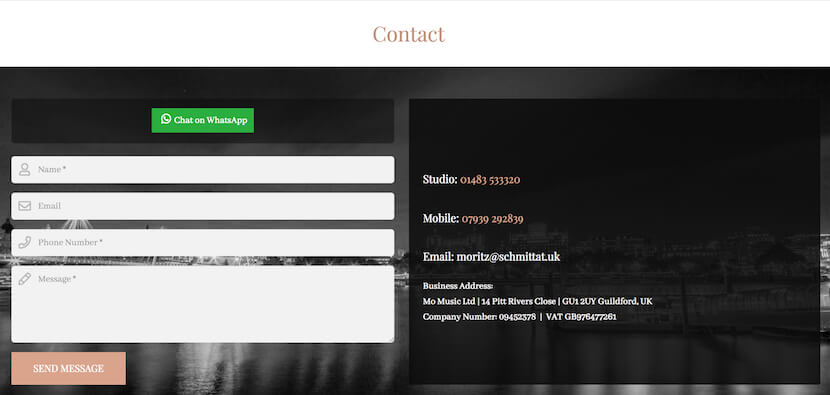
Moritz Schmittat Photography also has a link to contact him through WhatsApp on his contact page:

Location
Notice how the example above has a physical location listed as well? This is also important for freelance photographers.
“One thing I notice that’s missing most from photographer websites is their address,” says Meg Raiano, managing director at reCreativeAGENCY. “Since most photographers work out of their houses. it makes sense that they wouldn't want to put that information online, but at the very least a town and state should be included so people can find you.”
Some photographers are also mobile. Are you willing to travel? State that somewhere. Can customers ship products to you to photograph remotely? Let them know how the process works. Answering these questions upfront can also help you weed out leads that aren’t a fit.
Booking functionality
If you’re really looking to convert those who visit your site, consider adding a booking form right there so customers can pay a deposit and lock in a session. “It’s not enough to just put your pricing on your website with a contact form anymore,” Kirin says. “Potential clients want to buy now, while it’s top-of-mind and they’re seeing your amazing photos.”
TINYuproar has a booking button at the bottom of their pricing page:

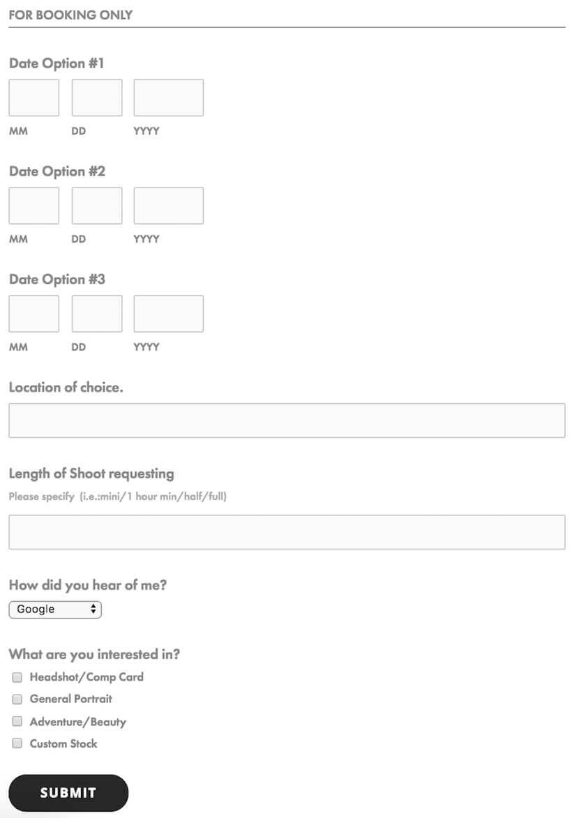
And photographer Leigh Germy has a booking form on her site, where users can choose a few dates to make an appointment:

To create something like this on your own site, consider these scheduling tools:
Social proof
Social proof is when you display that others have validated that you provide great services. Social proof takes a number of forms, from something as simple as listing your past clients on your site to something more in-depth like a full-blown case study.
As far as your freelance photography site goes, you’ll want to focus on a few kinds of social proof:
Logos
If you’ve worked for reputable brands in the past, ask their permission to publish their logo on your site. This will provide users with instant visual recognition, and validation of your work. If you’re good enough for a well-known company, then you’re good enough for them.
Mark Delong Photography showcases his big-name clients’ logos on a page dedicated to showing off this social proof:

Customer reviews
Customer reviews are powerful tools, and they provide awesome social proof. List yourself on popular review sites, ask clients to go there and leave feedback after their work with you, and use the content on your site.
“Link up with a public review-generating site to build trust with potential customers,” recommends Sophie McAulay, growth and content strategist at AND CO. Having these reviews on third-party sites also makes the content more valid.
Testimonials
McAulay also recommends using testimonials, which you can ask clients for on your own. “Where possible, include headshots or links to the customer's photos so that people can see that your testimonials are from legitimate customers,” she says.
But don’t limit your testimonials to a single page. “This is a huge no-no,” says Kirin. “Not just for SEO purposes, but also for client acquisition psychology.” She recommends interspersing them throughout your site, on multiple pages. “That way, the product (the photographs) and the testimonial work together to reinforce the authority of the photographer.”
FAQs and helpful content
“Photographers typically have well-designed websites that are extremely thin in terms of valuable content,” says Eric Johnson, a digital marketer for Minneapolis-based photographer Chara Juneau.
For corporate clients in particular, they want to know more than just the work — they want to know you, your services, your processes. “The photographers that answer these questions are the ones that get the bookings,” Johnson says. “They do better in terms of SEO, conversion, bounce rates and more.”
To Johnson’s point, without content, you’re not as discoverable. “You can have the most beautiful, artful images that’ll stun potential customers, but it won't matter if they can't find your website,” says Dr. Ty Belknap, CEO at Port Bell, Inc. “Search engines will have no idea you’re there if all you have is pictures.”
Belknap recommends 200–500 words on your homepage, and at least 200 words on every other page on your site.
Christian Shackleton, head web consultant at Springscript LLC recommends incorporating keywords into your content to help even more. “A great example of a keyword could be Chicago wedding photographer,” he says. Then incorporate those keywords into your website copy, as well as the title and URL of your site/page.


