When creating a product page that will convert browsers into buyers, ecommerce brands have to consider multiple factors: SEO-optimized copy, page layout, and product images.
Receive free ecommerce & product photography tips
A picture is truly worth a thousand words, and high-quality photos can say a lot about your products. Using the right images can make the difference between a slew of sales and a slow month. That’s why it’s crucial to invest in images that show off your products and represent your brand well.
To help ecommerce brands nail down the right product images, we consulted two conversion experts, who offered up their best actionable tips to get you started.
What is conversion rate optimization and why is it important?
Conversion rate optimization (CRO) is when you develop hypotheses about user behavior on your website and use tracking and analytics to improve the site and drive more conversions. Tracking and analytics involves a variety of things, including but not limited to A/B testing, heatmapping, session recordings, and form analysis.
You can use tools like Hotjar, Freshmarketer, and Crazy Egg (among others) to implement these tests, and combine it with data from Google Analytics, Omniture, or whatever tracking platforms you use.
CRO is important because it can help you find and plug the leaks in your conversion funnel and make sure your product pages are doing their job of pushing users to hit the Buy button.
One thing ecommerce brands want to pay special attention to is product photography. While it’s easy to focus on call-to-action buttons or headlines, product photos are very much a part of the shopping experience and they can be the difference between making or losing a sale.
Let’s look at some ways to optimize your product photos and understand if they’re converting.
Best practices to create high-converting product photos
While your product may be unique to your business, there are a few rules-of-thumb that business owners can follow.
“Product photos are a hugely important part of the online shopping process and one of the few factors on a product page that shoppers will take into serious consideration before they’re ready to make a purchase,” says Richard Lazazzera, founder of A Better Lemonade Stand, an online resource hub for ecommerce entrepreneurs. “This means your product photos have to be stellar and they have to be convincing.”
To ensure your product photos stand out, let’s take a look at a few tactics you can implement.
Use high-quality images
Product images aren’t an area where brands should cheap out. Because shoppers on your ecommerce site rely heavily on photos to decide whether they should make a purchase, it’s wise to invest in a good photographer (freelance or in-house) or use quality equipment to DIY your own product photoshoot. After all, nearly half of online consumers consider high-quality product photos to be the most influential piece of research in their purchase decision.
Good lighting
Your customers need to see your products well in photos — so it’s crucial to have a good lighting setup to highlight all your product’s features and details. Learn how to set up your lighting for product photoshoots.
Large, high-resolution images
Small and poor-quality won’t cut it when it comes to product photos. Grainy, blurry images degrade trust with your current and prospective customers and can turn them off to making a purchase.
“When it comes to product photos, the bigger, the better,” Lazazzera says. “With an online shopping experience, your shoppers can’t actually see or feel the product in real life so your product photo is one of the most important pieces of information they have to be able to evaluate whether the product is right for them. By giving your shoppers a large product photo, they can see your product in greater detail which will help them make their purchasing decision.”
High-resolution images allow shoppers to zoom in to examine product details. In our analysis of the top fashion ecommerce sites, 100% of the brands analyzed had zoom functionality on their product photos.
Recent studies from CXL Institute show that image size not only affects a buyer’s attention and engagement, but also their perception of its value. A high-resolution image implies that the product is also high-quality. And ultimately, how large you go with your images depends on the kind of product.

Image: CXL Institute
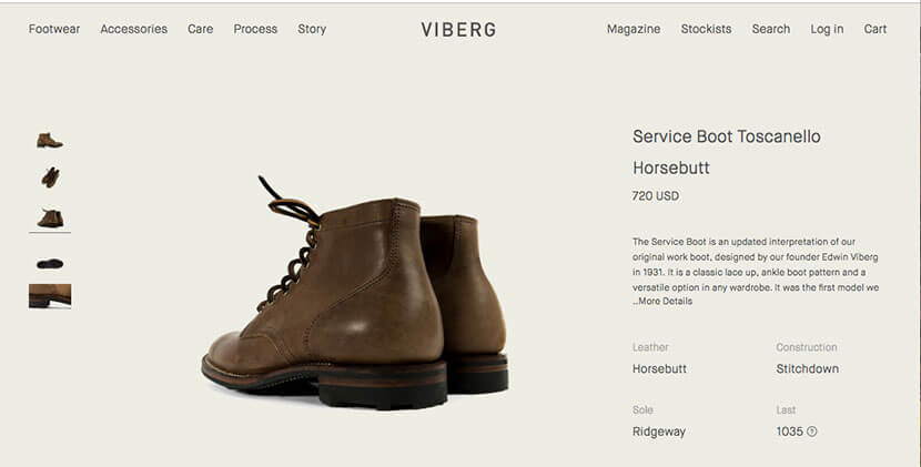
Photos from multiple angles
Show your products from multiple angles so customers know exactly what they’re buying. A single image from a single angle might not give shoppers all the visual information they need to make a purchase.
Footwear brand Viberg does an excellent job including multiple angles of every product.
Use lifestyle images to show products in context
Let’s be honest: Product photos can get boring pretty quick. To help yours stand out, you need to literally set the scene. In your photos, try illustrating your products in action.
For example, lifestyle brand Poketo shows all their products in context (i.e., a person using their items).
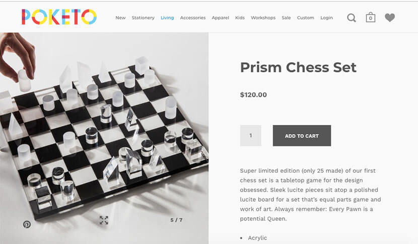
“Show your product in action and in its natural habitat, so to speak, because this will help shoppers imagine your product in their life more easily,” Lazazzera says.
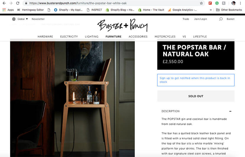
Ecommerce brands can also create “slice of life” images. These lifestyle-focused photos help shoppers envision how they’d use a product or how it would fit into their home. Check out this great example from Buster + Punch:
Ensure your photos represent your brand
As we previously mentioned, low-quality images can degrade trust and leave sales on the table. So it’s important to ensure that the product photos you use represent your overall brand well.
There are a few ways you can accomplish this goal, including:
- Use humans in your images: Nearly 62% of fashion brands feature people in their shots. Whether you use people to illustrate how to use a product or to show how a pair of pants fit, using photos of people on landing pages generally boosts conversions. Using real, live humans in your product photos also offer shoppers a sense of scale and can do the double duty of representing your target audience.
- Avoid cheesy stock images: While there are plenty of solid stock images out there, avoid the ones featuring over-the-top, grip-and-grin models. Although photos with people in them boost conversions, stock images are largely ignored.
- Make sure photos represent your products: Try to make sure all your images are a true likeness of your product and any variants. That means accurately showing colors, sizes, scale, etc. As Lazazzera noted, the last thing ecommerce brands want is for customers to receive a product that looks nothing like it did online — that’s a surefire way to destroy customer loyalty.
Be generous with the number of product images
In the case of product photos, more is more — so don’t just rely on a single image to get the job done.
“No shopper ever wished an ecommerce brand included fewer product photos, so don’t skimp out on them,” Lazazzera says. “In almost all cases, it’s better to have more product photos for your visitors to browse through than fewer product photos, so include as many as it makes sense to. More product photos equal more opportunities for your customers to examine and evaluate your product, which gives them more opportunities to determine whether your product is right for them.”
To keep a batch of photos visually interesting, Lazazzera also suggests using a combination of lifestyle and traditional white-background images to show off your products. Using the combination offers customers a variety of visual information to help them make their buying decision.
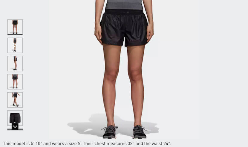
Some ecommerce sites, particularly apparel brands, long ago realized the draw of multiple product photos. Our analysis found that fashion brands use an average of eight photos on a single product page. And some apparel brands take this rule of thumb to the next level. For example, Adidas averages around 28 photos for each of its products.
Test your images for your unique business and audience
While the preceding tips are some solid best practices, don’t take our word for it. A large part of CRO is testing to see what tactics work best — and that’s what you’ll need to do as well with your product photos.
“Conversion rate optimization isn't black and white. What works for one ecommerce site may not work for another,” said Shanelle Mullin, a CRO expert with experience working on content and growth at ConversionXL. “I recommend avoiding best practices and running your own tests to discover what works for your specific store, for your specific audience. Everything is contextual and the type of product you sell matters a lot.”
Lazazzera suggests split testing, also known as A/B testing, different photo variations against each other to see which drives the most sales. And Mullin points out that ecommerce brands can test almost anything related to all of their product photos.
“Your test options are limited only by your imagination,” Mullin said. “I recommend conducting qualitative and quantitative conversion research to uncover test ideas supported by real data, though.”
Here are some ideas on things you can test:
- Image size
- Product angles in photos
- Number of images
- Image background (i.e., plain white versus lifestyle)
- Auxiliary products used in the photo
- Amount of white space
For example, VWO documents a sample split test that examines how different product photo sizes perform.
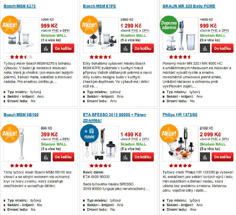
Control: Smaller product photos with text
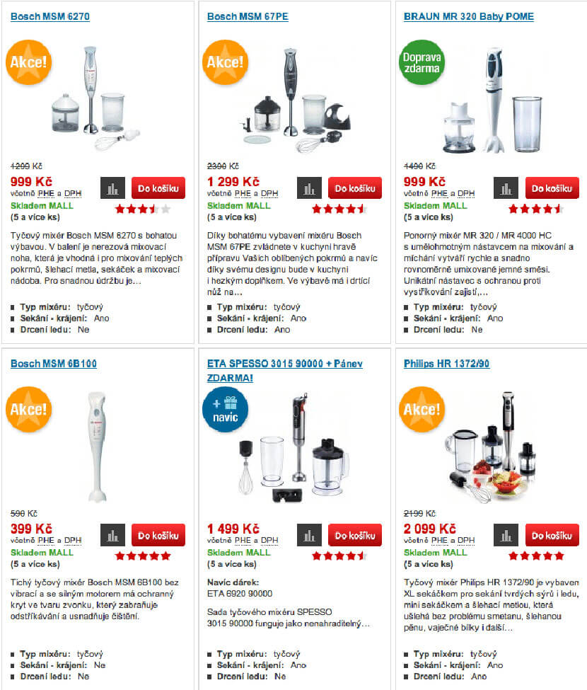
Variation 1: Larger product photos with text
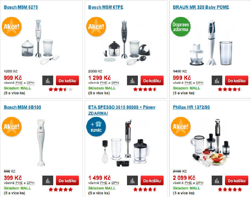
Variation 2: Larger product photos with text viewable when user holds mouse over product
The results? The final variation was the clear winner, which led to a 9.46% increase in sales.
Mullin recommends ecommerce brands run these tests on site to see how they perform “in the wild.” While you can run image A/B tests via email or social media, you’re simply testing engagement (opens, click-through rates, shares) on those mediums. On a live ecommerce site, you’re testing for actual conversions — which is ultimately your goal.
While there is plenty of A/B testing software available, you can try tools like Google Optimize, Optimizely, and VWO to get started.
Check out Shopify’s guide to A/B testing for more help with optimizing your product photos.
Moving forward with optimizing your product photos
Now that you have a deeper understanding of how you can optimize your images, you can make more informed decisions about how to tackle your product photos.


