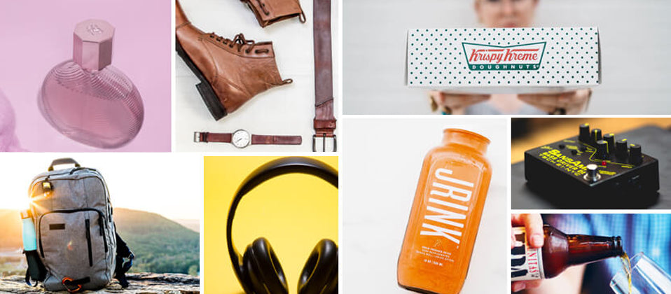
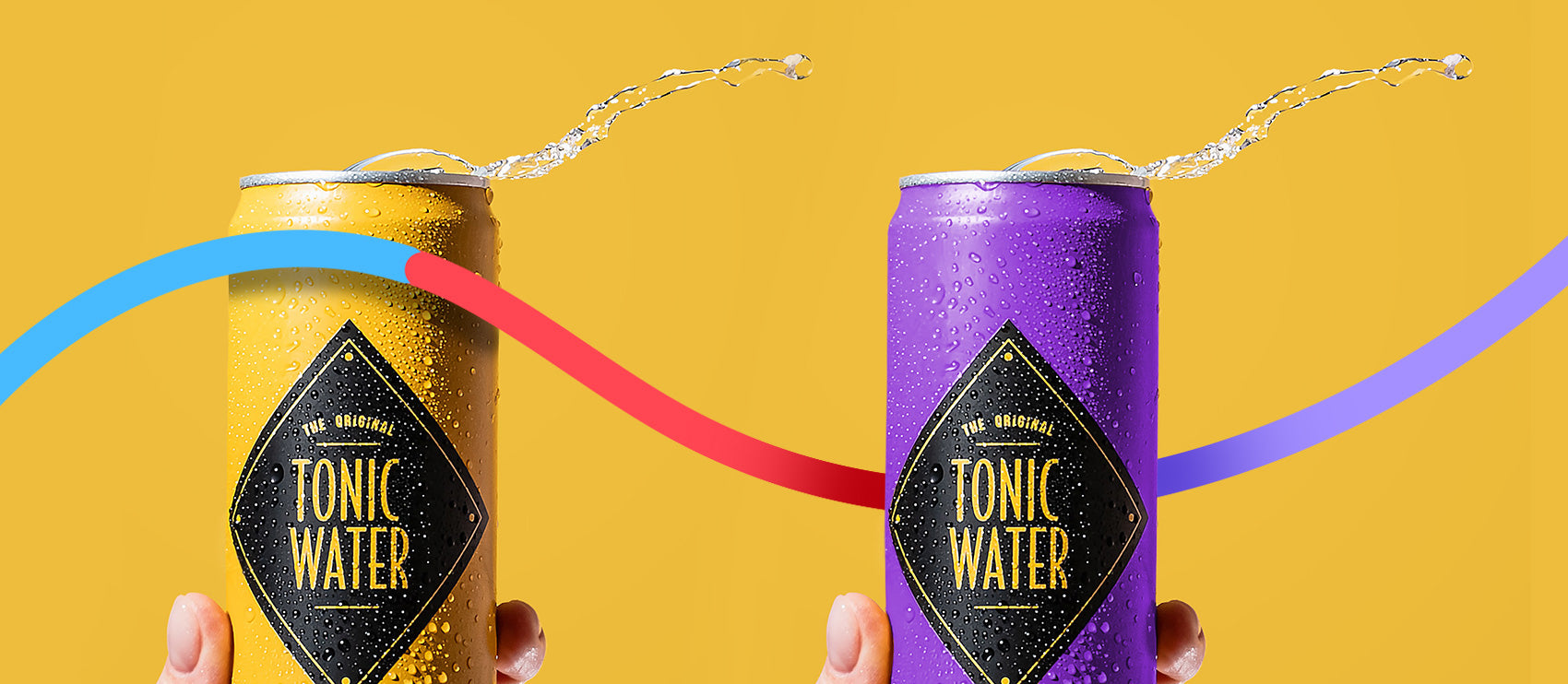
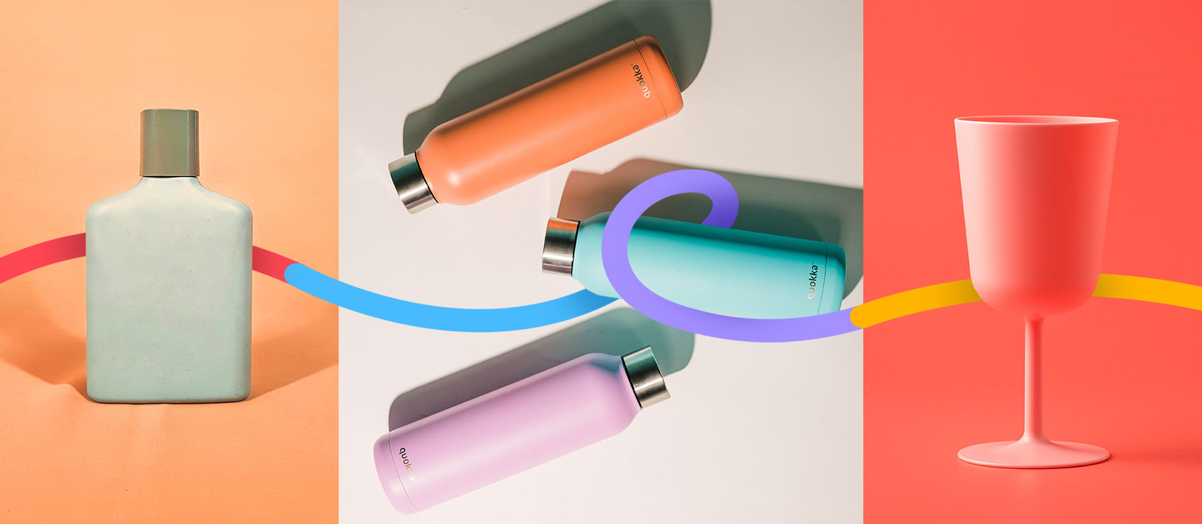
Product photography is absolutely crucial to ecommerce success. And we’re not just saying that because we edit so many product photos. Here are some stats from a Splashlight survey to prove it:
- Nearly half of online consumers consider high-quality product photos to be the most influential piece of research in their purchase decision
- Half want to see at least three to five product photos, showing various angles
- More than half want to see apparel in product photos on models
Need some creative inspiration for your own product photos? Check these 50 ecommerce sites with beautiful product photography:
1. The Live Fit Girls

Image: TheLiveFitGirls.com
Product photos feature personality that matches the personality of their target market, complemented by the colors of the headlines and buttons in the supporting copy.
2. Fitbit
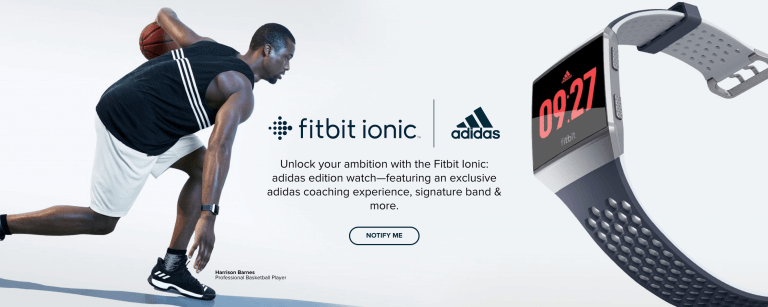
Image: Fitbit.com
The global fitness tech brand has high-quality, sleek photos that show the details of the products as well as how they are used in context.
3. Apple
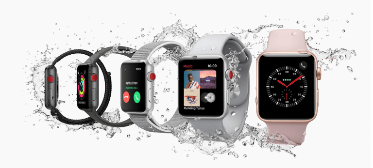
Image: Apple.com
The iconic tech brand has made smartphones, computers and other tech devices look sexier than ever. The brand has such a strong visual aesthetic, and all product photos support that image — including photos on their distributors’ sites.
4. Max Factor
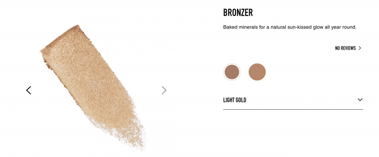
Image: MaxFactor.com
Whereas any beauty brand can display pictures of their products in the containers, as well as on models, Max Factor shows a smear-like rendition of their product too. It’s a great way to differentiate their products and bring them to life for online shoppers who can’t physically touch or test the cosmetics.
5. Victoria’s Secret
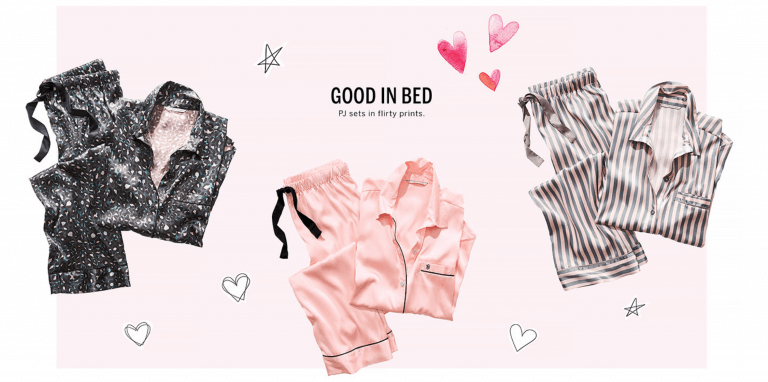
Image: VictoriasSecret.com
Victoria’s Secret has secured its spot on the top of the list for product photography for years. They know how to present their products in a way that speaks to their target audience, and even makes more than 20 million people tune into their annual televised fashion show.
6. Knotty Origami
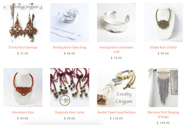
Image: KnottyOrigami.com
Knotty Origami has a very clear visual aesthetic, but they also present their product photo thumbnails in a way that demonstrates various angles and perspectives. This eliminates monotony and makes each product look interesting in its own right.
7. Modcloth
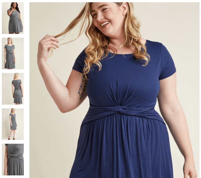
Image: Modcloth.com
Modcloth shows their products on models of different shapes and sizes, showing the versatility of various items and allowing their customers to better predict how it would look on them. They do the same with color variations, too.
8. Stihl

Image: STIHLUSA.com
While power tools are not necessarily beautiful to look at, Stihl presents them in a cohesive way that shows the products in use. This is especially important to their target customer.
9. Glasses Direct

Image: GlassesDirect.co.uk
While Glasses Direct has straightforward yet beautiful white-background product photos, their supporting visuals round out the impact for potential customers. Illustrations that outline dimensions help shoppers estimate how the frames would fit on their own faces.
10. Essie
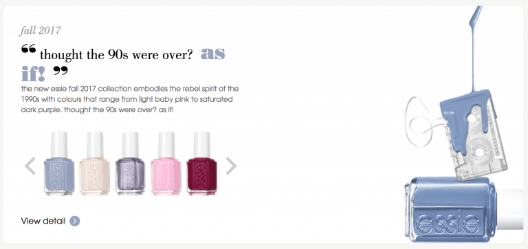
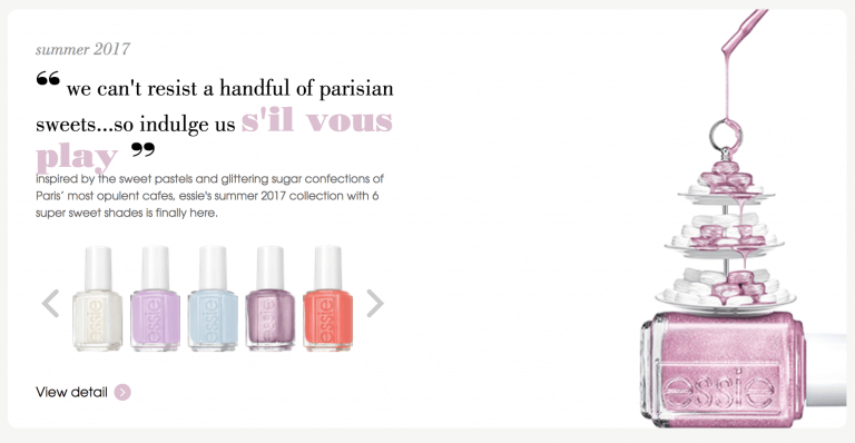
Images: Essie.ca
Essie is another beauty brand that has taken a creative approach to their product photography. The dripping nail polish over other items (such as baked goods or a cassette tape). The images pop out at browsers.
11. Made
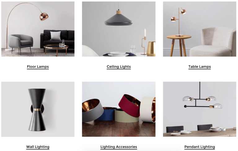
Image: Made.com
Who knew a set of lamp shades could be so elegant? The clear investment in maintaining a cohesive approach to product photography, Made combines an elegant and contemporary approach to their product photos.
12. Sonos
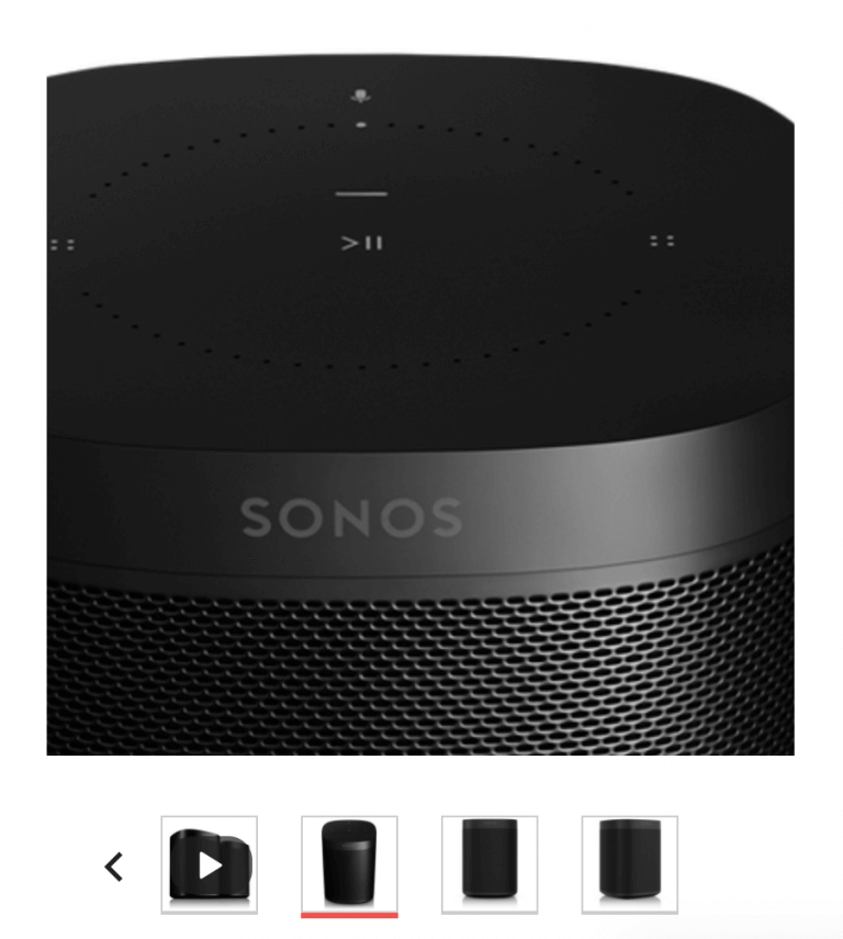
Image: Sonos.com
The zoom feature on the Sonos website allow users to clearly see the fine details, such as buttons on the speaker. The sleek aesthetic to the product photos elevate Sonos products and evoke a sense of luxury.
13. Vineyard Vines
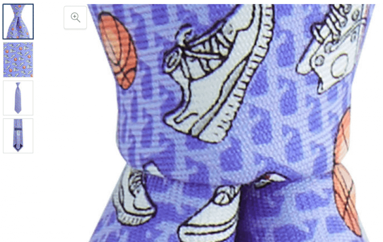
Image: Global.VineyardVines.com
Vineyard Vines has a fabulous zoom feature that allows users to zoom in quite close to the products, seeing every little detail as they browse online.
14. Mercedes-Benz

Image: Mercedes-Benz.com
It’s no surprise that a luxury car company has luxurious product photos. With their G-Class series of cars, Mercedes-Benz has managed to combine luxury and ruggedness into a single beautiful product photo.
15. BuyJumpRopes.net
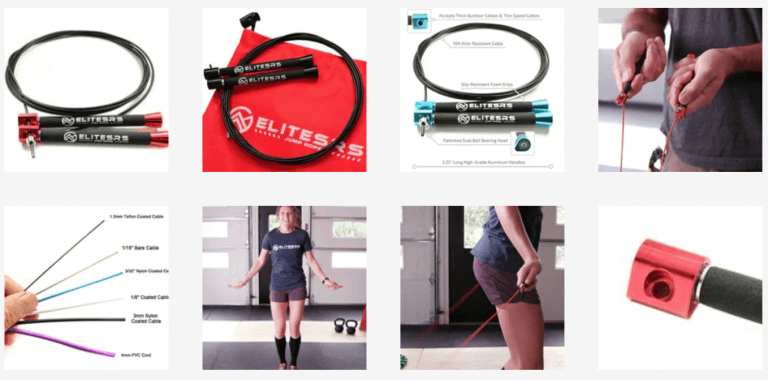
Image: https://www.buyjumpropes.net/elite-surge-fitness-speed-rope/
Even a product as seemingly simple as a jump rope deserves special attention to product photos. Close-ups of the details, in-use images and a breakdown of the components of the jump rope give online shoppers a well-rounded view of the product.
16. Hardgraft
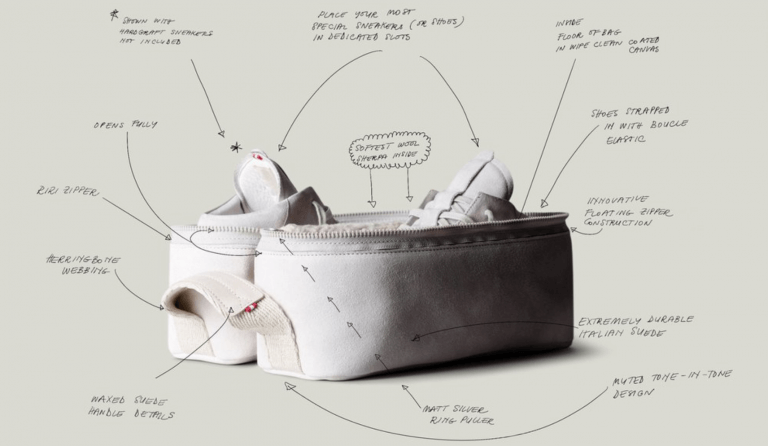
Image: Hardgraft.com
Hardgraft has clearly invested in a visual brand identity that they maintain across all product photos. Perhaps our favorite approach is how they’ve taken the features of the product and incorporated it into the photos themselves. It’s a creative approach to sprucing up what would otherwise be a bulleted list of specs and features.
17. Poppin
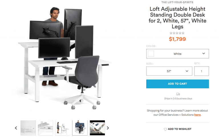
Image: Poppin.com
The office product ecommerce site has product photos and videos that show close-ups of the products’ features, the products in several use cases (which showcases versatility, one of the main benefits) and straightforward images without models or context.
18. PK Grills
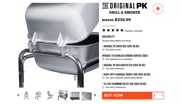
Image: PKGrills.com
PK Grills is another ecommerce site that uses a mix of close-up shots and product photos that show the entire product from further away. This also helps to demonstrate the quality of the materials of the grills.
19. Loehr
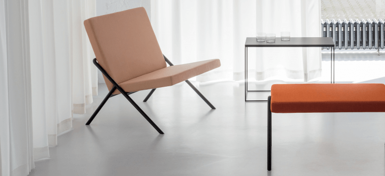
Image: Loehr.co
Loehr’s furniture is contemporary and modern, and they take the same approach to their product photography. The sophisticated product photos are a mix of contextual and white-background approaches, which is helpful for online browsers.
20. Pencil by 53

Image: fiftythree.com
Pencil by 53 has high-quality, close-up visuals of its seemingly simple product.
21. Deliqa Gems
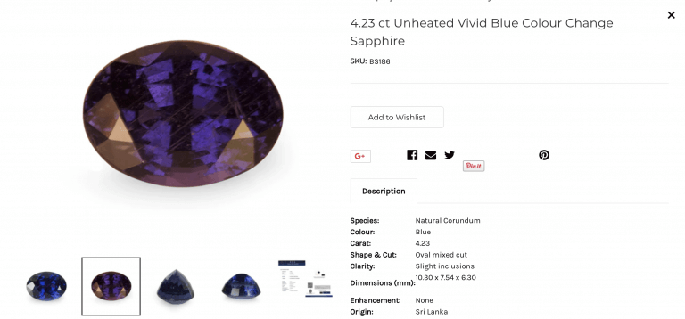
Image: DeliqaGems.com
Deliqa Gems takes a simple, straightforward approach to their product photos. They keep the focus on the stones and their quality, minimizing distraction for the customer.
22. Linus Bike

Image: LinusBike.com
Linus Bike has tons of personality in their product photos. White-background shots are mixed in with funky lifestyle shots for a fun mix.
23. Pilgrim Collection
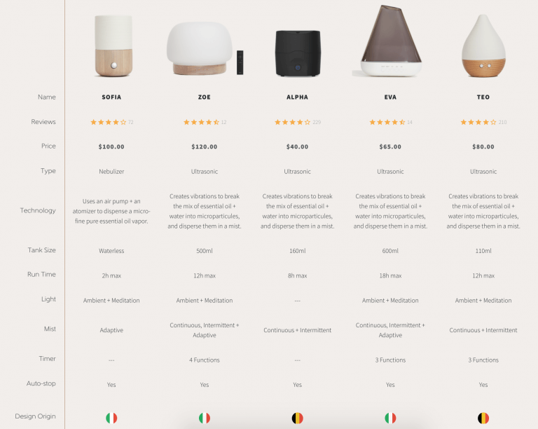
Image: PilgrimCollection.com
Another brand that has clearly invested in their visual brand identity, Pilgrim Collection has supplemented their product photos with information comparison charts that make the buying decision simpler.
24. Prive Revaux
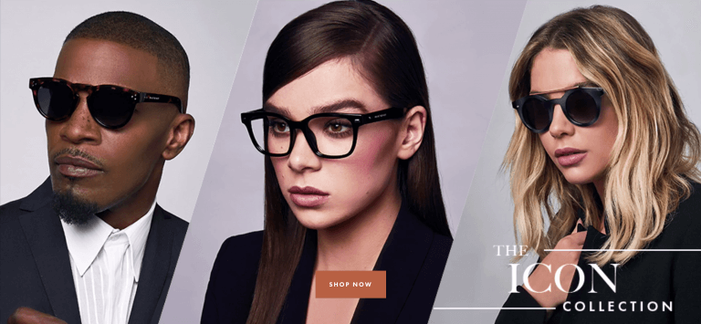
Image: PriveReveaux.com
The sunglass retailer has chosen to feature high-profile celebrities with whom the brand has partnered to create product collections. The instant recognition of such individuals is a clever way to build trust with customers while also displaying the products in an appealing way.
25. Wood/Grey
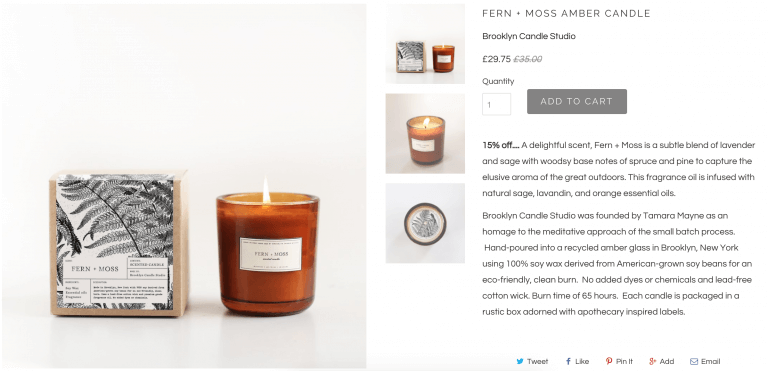
Image: WoodGrey.com
Simple and clean are two words that describe Wood/Grey’s products and website — and their product photos are no different. The brand features the packaging (super helpful for gift-giving) and the products from different angles.
26. Zymbol
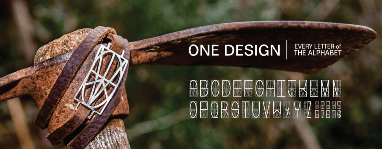
Image: Zymbol.net
Zymbol has a mix of creative lifestyle images and product photos on white background that bring their items to life for online shoppers.
27. Wease
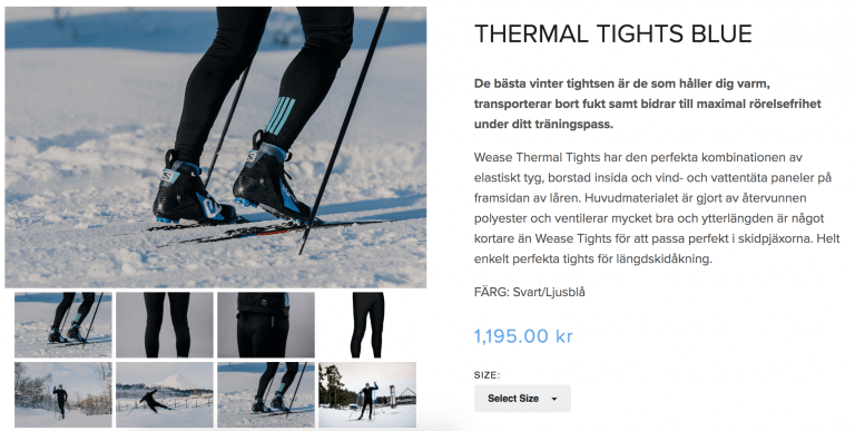
Image: Wease.se
The interesting angles for the lifestyle product photos make Wease’s items stand out and come to life for potential buyers. The visual aesthetic is cohesive across all site imagery, evoking a strong brand identity.
28. Dots & Loops
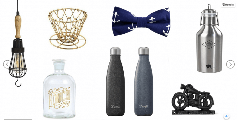
Image: DotsAndLoops.ca
Dots & Loops groups images with a similar aesthetic and color scheme on their homepage. These “collections” rotate, so there are distinct groups that appeal to each of their types of customers.
29. Pow Gloves
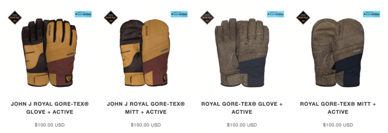
Image: PowGloves.com
Pow Gloves does a great job at showcasing the range in colors that each product is available for purchase. As the user hovers over the product thumbnail, it changes color to show other variants. This entices click-throughs for customers to explore what other options there may be.
30. Bee Stinger

Image: BeeStinger.com
Bee Stinger has a very specific target demographic. The banner images throughout their website directly appeal to that market, and the product pages themselves feature the merchandise on white background so customers can explore more.
31. Camelbak
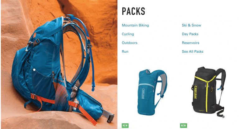
Image: Camelbak.com
Aspirational and contextual product photos are Camelbak’s forte — it helps the outdoor gear brand’s customers envision how their lives would be enhanced through their products.
32. Krash

Image: KrashCo.com
At first glance, you may not think of “beautiful” to describe Krash’s product photography. However, what’s great about their product photos is that they clearly appeal to a specific demographic. The out-of-the-box approach to putting helmets on fingertips designed to look like heads is a fun way to relate to their younger audience.
33. Jamie Pryde

Image: JamiePryde.com
Jamie Pryde curates their selection of one-of-a-kind products — and because the pieces are so unique and detailed, the product photos show an exhaustive number of angles and close-ups. This helps customers really get a feel for the interesting items without having the chance to touch and see them.
34. Barx Sox
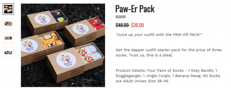
Image: BarxSox.com
There’s no denying the appeal of cute animals, and Barx Sox sprinkles photos that feature pups throughout their site. They up the fun factor with creative lifestyle shots of humans, and the product pages display the high-quality packaging and detailed shots of the socks themselves.
35. Black Skullz
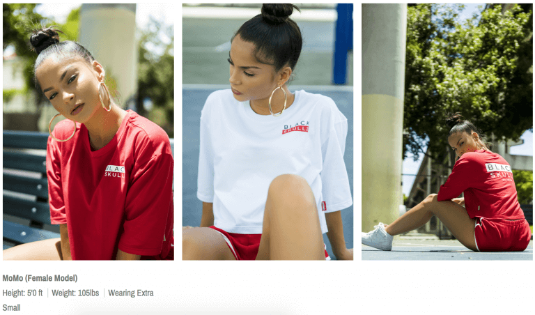
Image: BlackSkullz.com
For Black Skullz, it’s less about the photos themselves and more about who is in the photos. They choose models that have attitude and fit their target market, plus they share information about the models’ measurements and how that dictates which size to get, which helps customers compare for their own needs.
36. Chiavare
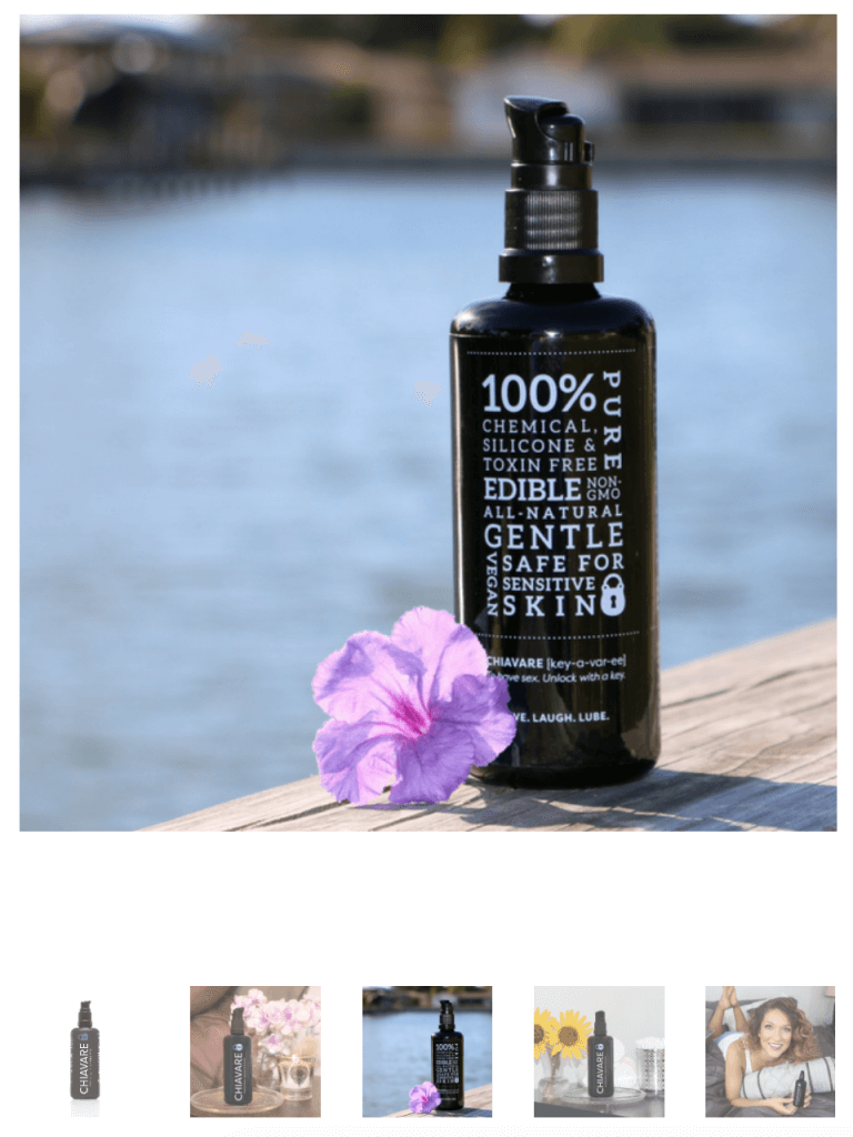
Image: ChiavareOil.com
Targeted towards women, Chiavare has product photos on white backgrounds mixed in with female-driven backgrounds featuring flowers and creative lighting.
37. June Berry Company
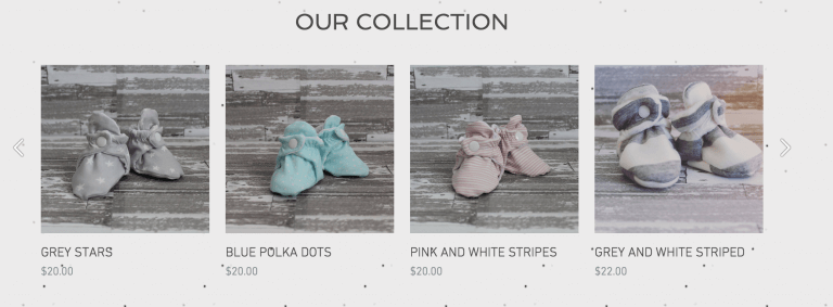
Image: JuneBerryCompany.com
June Berry Company has a distinct background for most of its product photos: a gray, wooden background that accomplishes a visual aesthetic that is cohesive with the website and the brand. Some photos also feature the booties on cute little baby feet, which is hard for anyone to resist.
38. Dryad Tea
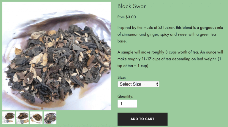
Image: DryadTea.com
Lots of close-ups of Dryad Tea’s small products offer shoppers a detailed look.
39. Xenclip
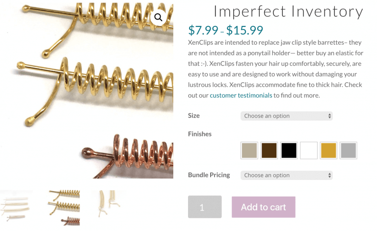
Image: Xenclip.com
Xenclip’s products are also small in size, so high-quality photos of close-ups of the products are essential to the brand. They’ve clearly invested in professional photography, and it has paid off.
40. Winter Garden Studios
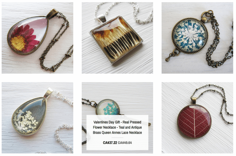
Image: WinterGardenStudios.com
Textured backgrounds and high-quality photography make Winter Garden Studios products appear whimsical and elegant.
41. Allette
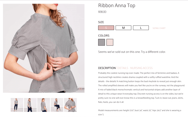
Image: AlletteBoutique.com
Allette shows not only the fashion but also the function behind its product. They show the apparel from a number of angles, as well as feature models in various positions, which helps customers envision how the products would work for themselves.
42. Third Love
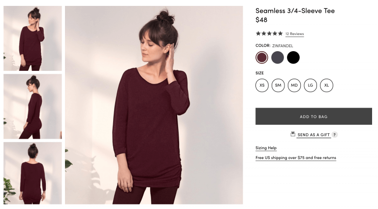
Image: ThirdLove.com
Instead of using image editing to create color variants for their products, Third Love shoots custom photography for most of the variants. This creates a more lifelike effect that appeals to shoppers.
43. Landyachtz
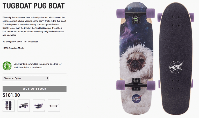
Image: Landyachtz.com
Landyachtz shows their skateboards from different angles, while making sure the design is front and enter in the thumbnail and main product image.
44. Toyah Perry
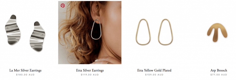
Image: ToyahPerry.com
Another hover effect, Toyah Perry has white background thumbnails that change to contextual photos for browsers.
45. Wrightwood Furniture

Image: WrightwoodFurniture.com
Simple and sleek — two words that describe the style of Wrightwood Furniture’s customer and the style of their product photography.
46. Ethno Tek

Image: EthnoTek.com
Like Camelbak, Ethno Tek displays its products in context through aspirational and adventurous imagery. They also employ the hover effect to show browsers that additional color options are available for select products.
47. Studio Neat
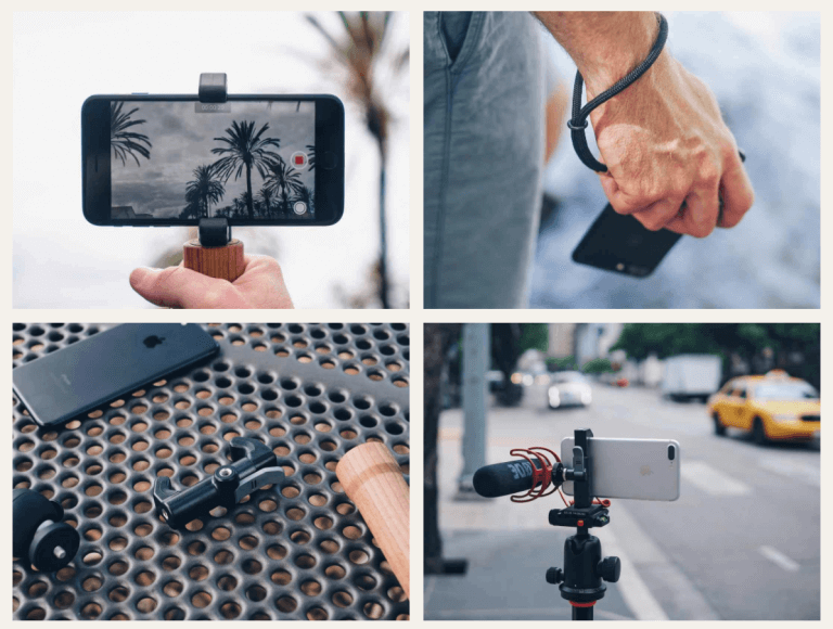
Image: StudioNeat.com
The product photos themselves have white backgrounds; scroll a bit further down the page to find a number of contextual shots. These images show the versatility and use cases for Studio Neat’s products.
48. Shop Fiercely
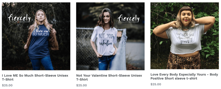
Image: ShopFiercely.com
Shop Fiercely has a clearly defined target customer — and the women’s apparel brand uses photography that appeals to this demographic. Diverse models with attitude empower and inspire female customers.
49. Bang & Olufsen
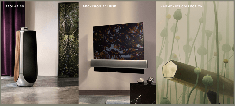
Image: Bang-Olufsen.com
Has tech ever looked so good? Elegant, forward-thinking and innovative, these product photos evoke a sense that the products are of the same quality of their beautiful images.
50. Mulberry
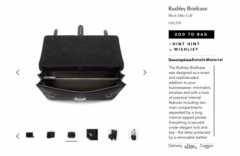
Image: Mulberry.com
Mulberry shows all of its products — the outside, the inside, close-ups and contextual — which helps consumers compare more easily and feel confident in their purchase.
Creative juices flowing? Style your next product photoshoot yourself >

