Changing a garment from blue to green in a photo might sound like a simple color adjustment. But clothing isn’t made from flat blocks of color.
A photograph of a shirt, dress or jacket contains folds, seams, stitching, shadows, highlights and thousands of tiny variations created by the fabric itself.
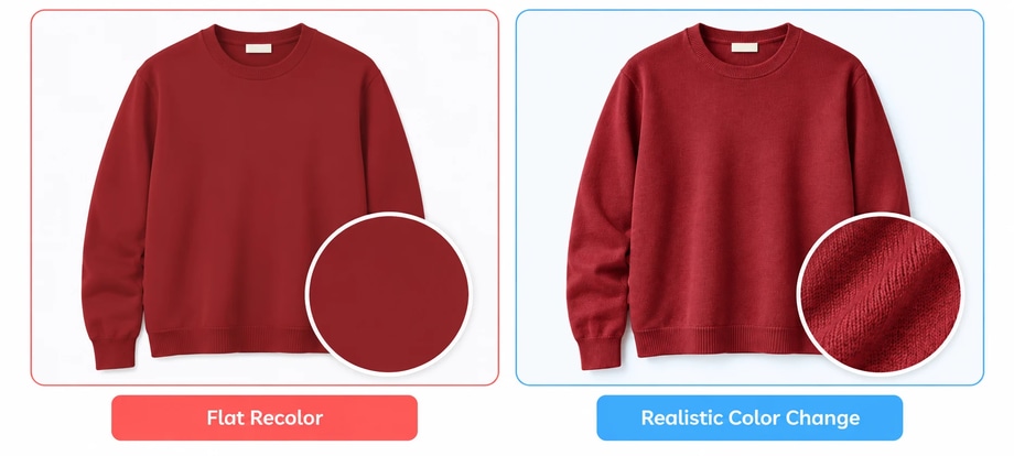
Change the color without preserving those details and the garment can quickly start to look digitally painted.
For ecommerce, that’s particularly problematic. The edited image may be representing a genuine colorway that a customer can actually buy, so it needs to remain believable as the same garment in a different color.
The secret isn’t simply choosing the right new hue. It’s changing the color while keeping everything that makes the fabric look like fabric.
Here we will look at how to change clothing color in a photo while keeping fabric texture realistic.
Why is changing clothing color more difficult than it looks?
Look closely at a photograph of a blue cotton T-shirt.
It’s unlikely that every part of the shirt is exactly the same blue.
Where the fabric faces the light, the blue appears brighter. Inside folds, it becomes darker. Seams create tiny shadows. Creases change how light falls across the surface. The weave may introduce even finer tonal variation.
All of that information helps your eye recognise fabric, shape and depth.
A realistic clothing color change therefore needs to preserve:
- Fabric texture
- Highlights
- Shadows
- Folds and creases
- Seams
- Stitching
- Fine fibres
- Natural tonal variation
Remove those details and you haven’t really recolored the garment.
You’ve covered it.

1. Start with the highest-quality clothing photo available
A realistic recolor begins with the source image.
If fabric texture is clearly visible in the original photograph, you have information to preserve during editing.
If the image is heavily compressed, badly exposed or too small, some of that detail may already have disappeared.
Ideally, start with an image that has:
- Good resolution
- Sharp fabric detail
- Controlled lighting
- Visible highlights and shadows
- Clear garment edges
- Accurate focus
Avoid thinking that a perfectly evenly lit garment is necessarily better.
Some tonal variation is useful because it describes the garment’s shape.
The goal is to start with a photograph containing enough information for the edited color to behave naturally.
2. Isolate the garment without selecting everything around it
Before changing color, isolate the area of clothing you actually want to recolor.
For a simple T-shirt photographed on its own, that might be straightforward.
On a model, it becomes more complicated.
Your selection may run alongside:
- Skin
- Hair
- Jewellery
- Shoes
- Other garments
- Buttons
- Zips
- Background objects
And not every part of the garment necessarily needs to change.
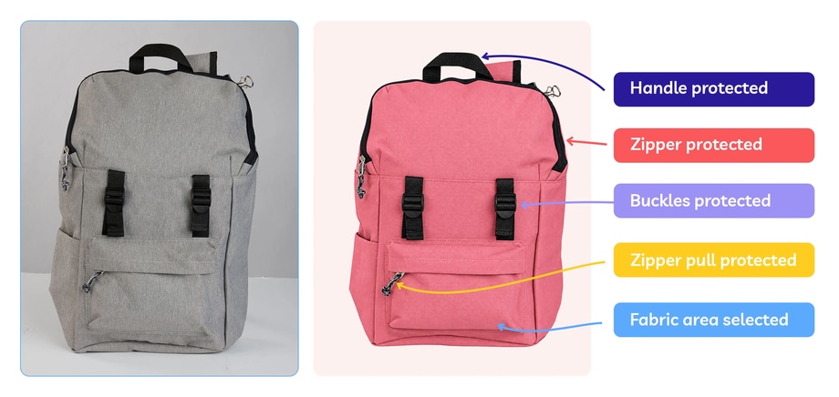
Imagine a blue jacket with silver zips, black buttons and white embroidered branding. If you’re creating a burgundy version of the jacket, those details may need to remain exactly as they are.
Use an accurate selection and layer mask so the color adjustment is limited to the intended fabric.
3. Change the color without replacing the tonal detail
This is the most important part.
Don’t simply place a solid new color over the clothing. Instead, use an adjustment that allows the underlying light and dark information to remain visible.
In Photoshop, a Hue/Saturation adjustment layer provides one useful non-destructive method. The garment can be isolated with a mask and the Hue adjusted without permanently altering the original photograph.
For more complex changes, additional tonal or color adjustments may be required.
But whichever tools you use, the principle remains the same: Change the hue. Preserve the photograph underneath it.
If a crease was darker in the original garment, it should generally remain darker after recoloring.
If a raised area caught the light, that highlight should still make sense in the new color.
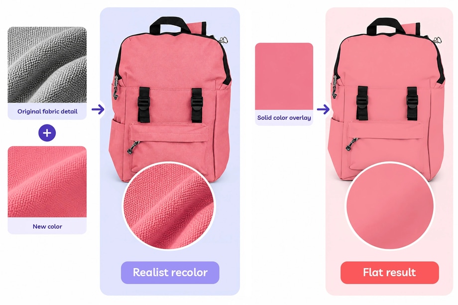
4. Preserve the fabric’s texture
Fabric texture is one of the biggest giveaways of a poor clothing recolor.
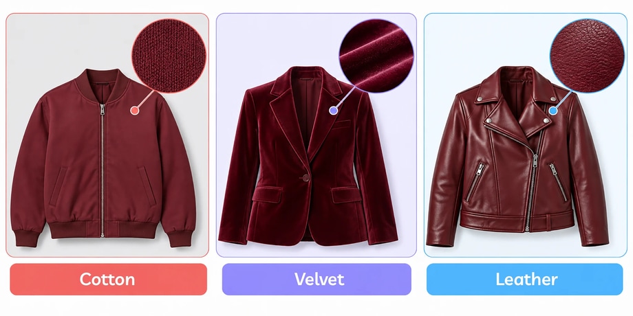
Consider how differently these materials behave:
Cotton may have a relatively matte, even surface.
Denim has a distinctive weave and often contains considerable tonal variation.
Knitwear has raised loops, fibres and shadows between stitches.
Satin produces strong, smooth highlights.
Velvet can shift dramatically between light and dark depending on the direction of the pile.
Suede has a soft nap that creates subtle variation across the surface.
Leather may produce much harder or glossier reflections.
The same target color should therefore not look identical on every material.
If you recolor a satin blouse and a cotton T-shirt burgundy, both may be burgundy — but the light should interact with each surface differently.
That’s why realistic clothing recoloring is about more than matching a color value.
The material still needs to behave like itself.
5. Keep the folds, highlights and shadows believable
A fold is not just a darker version of the garment’s base color.
Its appearance depends on how the fabric curves away from the light.
Similarly, highlights aren’t simply pale patches added on top.
They’re part of the original lighting environment.
When recoloring clothing, regularly compare the edited version with the original.
Ask:
- Are the folds still obvious?
- Do the shadows still describe the garment’s shape?
- Are the highlights still visible?
- Does the clothing still look three-dimensional?
If the new color makes the fabric look flatter than the original, something has been lost.
This is particularly important when moving between very different colors.
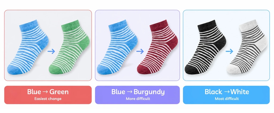
A mid-blue garment changed to mid-green may retain much of the original tonal structure naturally.
A black garment changed to cream requires much more work because the target color has a fundamentally different brightness range.
6. Don’t recolor stitching and details automatically
Stitching is easy to overlook because it’s small. But those tiny details can make the difference between a believable product variant and an inaccurate one.
Suppose the original blue jeans have orange contrast stitching.
Does the black version also have orange stitching?
If yes, preserve it.
If the real black version uses black stitching, then the stitching needs to change too — but deliberately, not simply because it happened to fall inside your mask.
The same applies to:
- Embroidery
- Logos
- Buttons
- Zips
- Rivets
- Labels
- Piping
- Lace
- Printed graphics
- Decorative trims
For ecommerce, the edited image should represent the actual variant, not merely an attractive interpretation of it.
7. Be especially careful with patterned clothing
Solid-color clothing is generally the easiest candidate for recoloring. Patterns introduce another layer of complexity.
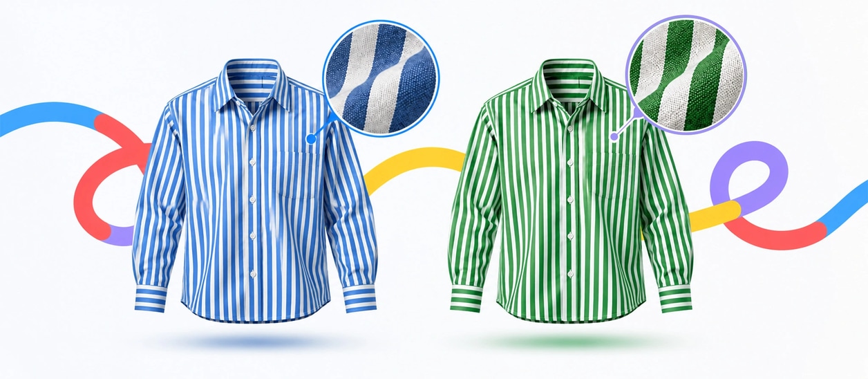
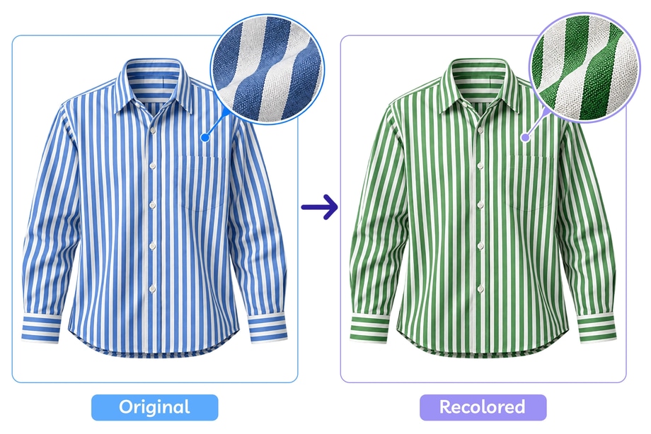
Imagine a blue-and-white striped shirt.
If the product variant is green-and-white, only the blue areas should change.
The white stripes need to remain white.
Now consider:
- Floral prints
- Checks
- Logos
- Graphics
- Multicolored embroidery
- Printed fabric
- Gradient dyes
A global color adjustment can shift colors that aren’t supposed to change.
In these situations, more precise color targeting and masking may be required to isolate only the intended part of the design.
And if the real variant has a different pattern rather than simply a different color, recoloring may not be appropriate at all.
That’s a different physical product and should usually be photographed.
8. Dark-to-light color changes need extra care
Not all clothing color changes are equally difficult.
Changing:
blue → green
is very different from:
black → white
A dark source garment may contain limited visible information in its deepest shadows. Simply increasing Lightness won’t magically reveal fabric detail that wasn’t captured in the original photograph.
Similarly, turning a white garment into a very dark color can make existing highlights behave unnaturally if the edit is too aggressive.
Large brightness changes may require separate tonal work alongside the color adjustment.
This is one reason it’s useful to choose your master photograph strategically if you know you’ll be creating several product variants from it.
A well-exposed mid-tone garment can sometimes provide more usable tonal information than an extremely dark or bright source color.
But the suitability of the master image depends on the garment, material and target colorways.
9. Match the edited clothing to a real color reference
For ecommerce, “red enough” isn’t enough. If the edited photograph is going to represent a real product variant, use a reliable reference for the target color.
That could be:
- The physical garment
- A fabric swatch
- A manufacturer-approved reference
- A color reference captured during the shoot
- An approved product specification
This is important particularly when a collection contains closely related shades.
For example:
cream / ivory / ecru
or
navy / royal blue / cobalt
or
burgundy / wine / oxblood
The goal here is to create a useful representation of the version customers can actually buy.
10. Check how the new color behaves on the model
If the clothing is being worn rather than photographed on a mannequin or flat lay, don’t inspect the garment in isolation.
Look at its relationship with the rest of the photograph.
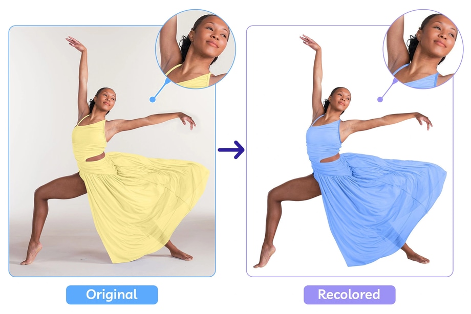
Does the new color spill onto the model’s skin?
Have fine hairs around the neckline accidentally changed?
Has the recoloring altered jewellery or accessories?
And what about reflections?
A strongly colored garment can sometimes cast subtle reflected color onto nearby skin or surfaces in the original photograph.
If you make a dramatic color change but leave a strong blue reflection from the original garment on the model’s skin, the finished image may feel inconsistent.
Equally, don’t invent strong reflected color that wasn’t naturally present simply to make the edit appear sophisticated.
The aim is visual coherence.
11. Review all clothing colorways together
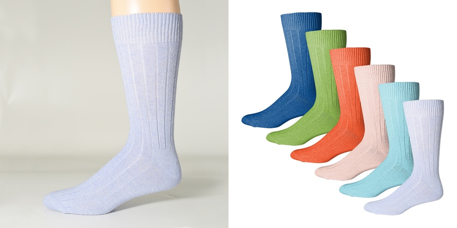
If you’re creating several variants from one master photograph, review the complete set side by side.
This makes inconsistencies much easier to spot.
Check whether:
- The garment remains the same shape
- Texture is equally visible in every version
- Stitching and hardware are consistent
- Shadows remain believable
- One colorway looks unnaturally saturated
- Highlights haven’t disappeared from darker versions
- Different variants still feel like photographs of the same garment
One of the major advantages of creating color variants from a master image is that pose, crop, scale and lighting can remain consistent.
Don’t undermine that advantage through inconsistent editing.
Can AI clothing color changers preserve fabric texture?
AI clothing color changers can produce impressive results very quickly, particularly for straightforward garments and visual experimentation.
But speed isn’t the only consideration for ecommerce.
Look closely at:
- Fabric weave
- Stitching
- Logos
- Garment edges
- Folds
- Highlights
- Shadows
- Prints
- Hardware
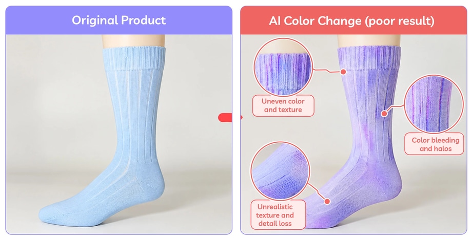
An automated tool may create a convincing image at first glance while subtly changing details that should have remained identical.
Generative tools can also interpret the task rather than simply perform a controlled pixel-level color adjustment. Depending on the tool and image, that can mean modifying texture, seams or other product characteristics alongside the requested color.
That may be acceptable for concept imagery.
It’s more problematic when the image is supposed to represent an exact ecommerce SKU.
We’ll explore this properly later in our guide to AI color changers vs professional color change editing.
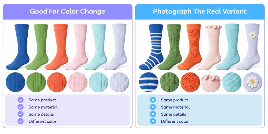
When should you photograph the real clothing variant instead?
Color change editing makes most sense when color is genuinely the main difference between the variants.
For example:
Same garment + same fabric + same construction + different dye color
is a strong candidate.
But if another colorway also has:
- Different fabric
- Different pattern
- Different stitching
- Different buttons
- Different trim
- Different transparency
- Different finish
- Different construction
then you’re no longer dealing with a simple color change.
Photographing the real garment is likely to provide a more faithful representation.
The best clothing recolor should still look like fabric
A successful clothing color change should look like the same garment in a different color. Fabric texture, folds, stitching, shadows and highlights should remain intact, with only the elements that genuinely differ between colorways changing.
Achieving this across an entire ecommerce catalogue requires careful, consistent editing.
Path’s professional color change services create realistic product color variants while preserving the details that make each garment look natural.