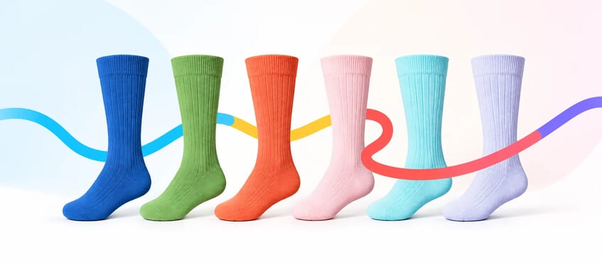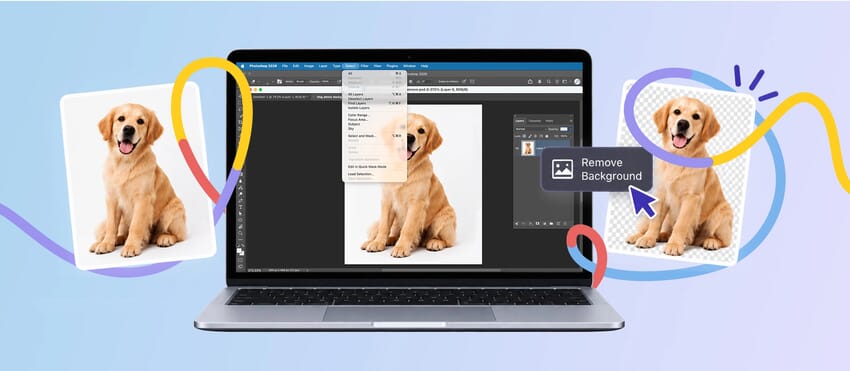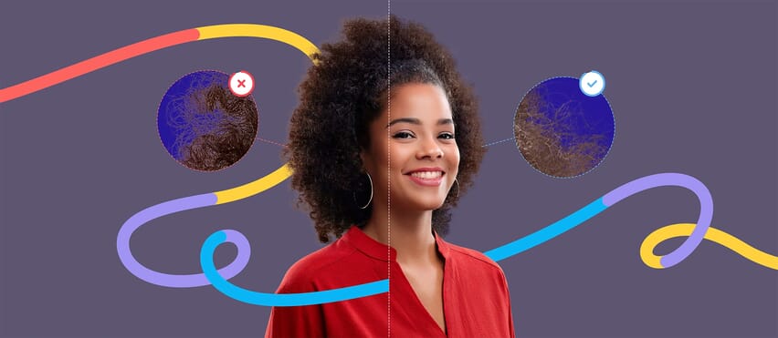
You want to change the blue fabric on a product to green - but there’s also blue in the background, logo or another part of the image.
Move the wrong Photoshop slider and suddenly all of it changes.
This is one of the most common problems when recoloring an image. The challenge isn’t necessarily changing the color itself. It’s telling Photoshop exactly which pixels you want to change and which ones you want left alone.
For precise color changes, a useful approach is to combine Photoshop’s Color Range selection, Hue/Saturation adjustment layer and layer mask.
Adobe’s Color Range tool lets you select pixels based on a sampled color or tonal range, then refine how many similar colors are included. Combined with a mask, this gives you much more control over where your adjustment appears.
Here’s how to do it.
When would you need to change just one color?
Imagine you’re editing a product photo of a model wearing a blue jacket.
You want to turn the jacket green.
But the photograph also contains:
- Blue jeans
- A blue object in the background
- Blue details in a logo
- Cooler blue tones within shadows
Changing every blue pixel in the photograph would give you a very different image from the one you intended.
The same problem appears frequently in ecommerce photography.
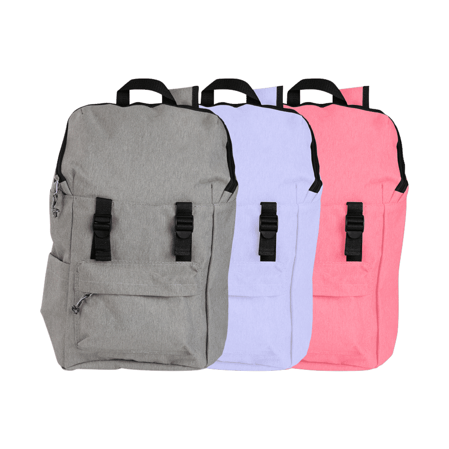
You may need to recolor the main fabric of a handbag without changing its stitching. Change the upholstery on a chair without affecting a similarly colored prop. Or create another T-shirt colorway while keeping the model and background untouched.
The solution is to target both the color and the area where that color appears.
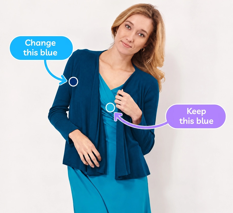
Step 1: Open your image and identify the exact color
Open your image in Photoshop and decide precisely what you want to change.
This sounds obvious, but it’s worth doing before making a selection.
Look at the object closely.
Is it really one uniform color?
A blue jacket, for example, might contain pale blue highlights, mid-blue fabric and dark navy shadows. All of these variations contribute to what we perceive as the jacket’s overall color.
If you sample too narrow a range, parts of the original blue may remain.
Sample too broadly and Photoshop may begin selecting blue areas elsewhere.
That’s what we’ll control in the next few steps.

Step 2: Go to Select > Color Range
From Photoshop’s top menu choose:
Select → Color Range
This opens the Color Range dialog.
Set Select to Sampled Colors and use the Eyedropper to click the color you want to change.
Photoshop creates a selection based on that sampled color.
In the preview:
White = selected Black = not selected Grey = partially selected
Adobe’s current Color Range tool also offers other preview modes, including Black Matte, White Matte and Quick Mask, which can make it easier to judge a difficult selection.
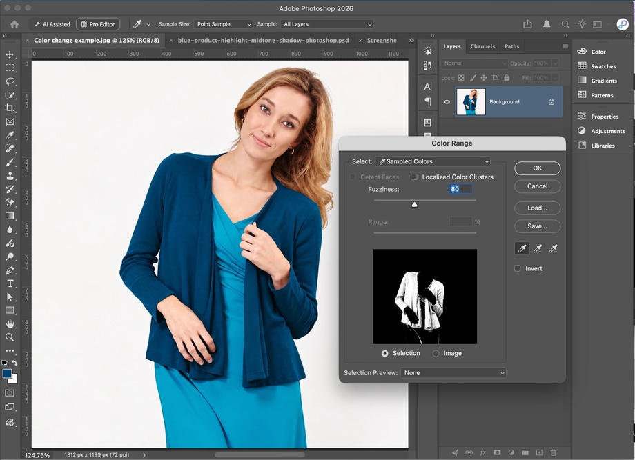
Step 3: Use Fuzziness to control how much color is selected
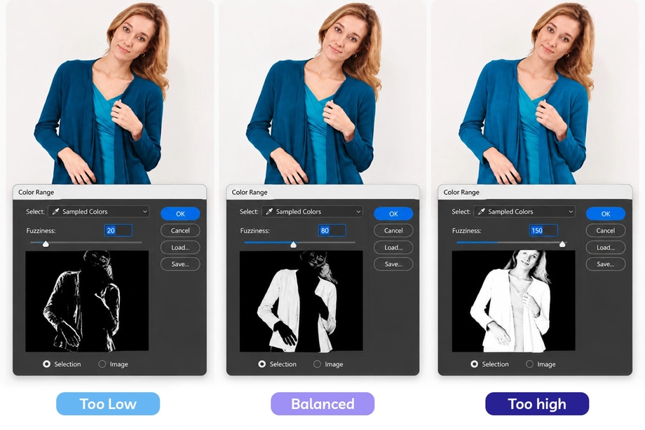
This is where you control how similar a pixel’s color needs to be to your sampled color before Photoshop includes it in the selection.
Adjust the Fuzziness slider.
- A lower Fuzziness value creates a narrower selection around the sampled color.
- Increase it and Photoshop includes a broader range of related colors.
Adobe describes Fuzziness as the control for widening or narrowing the selected color range.
For our blue jacket, increasing Fuzziness might help capture the lighter and darker blue variations in the fabric. But don’t simply push it as high as possible. Watch the selection preview.
You want enough range to capture the product naturally without unnecessarily pulling similarly colored areas elsewhere into the selection.
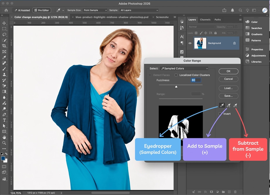
Step 4: Add and subtract colors from your sample
One Eyedropper sample isn’t always enough.
If parts of the object aren’t being selected, use the Add to Sample Eyedropper to include additional shades.
You can also hold Shift while sampling.
If Photoshop has included a color you don’t want, use the Subtract from Sample Eyedropper, or hold Alt on Windows / Option on Mac while sampling.
Adobe supports both methods in Color Range.
This is particularly useful for textured products because the same material can contain numerous related shades.
Rather than trying to find one magic Fuzziness setting, you can build a more representative sample of the colors that actually belong to the product.
Step 5: Use Localized Color Clusters when the same color appears elsewhere
Here’s where things get particularly useful for our original problem.
Suppose the jacket is blue - but there’s also a blue chair in the background.
They may be close enough in color that Color Range selects both.
If available for your selection, enable Localized Color Clusters.
This allows Photoshop to take the location of sampled colors into account rather than treating every similar color across the entire photograph equally. You can then use the Range control to limit how far from the sampled area Photoshop includes matching colors. Adobe specifically describes Localized Color Clusters as a way to create a more precise, spatially constrained Color Range selection.
So instead of saying:
“Select this blue everywhere.”
you’re moving closer to:
“Select this blue around here.”
That distinction can be extremely useful when the same or similar color appears elsewhere in an image.
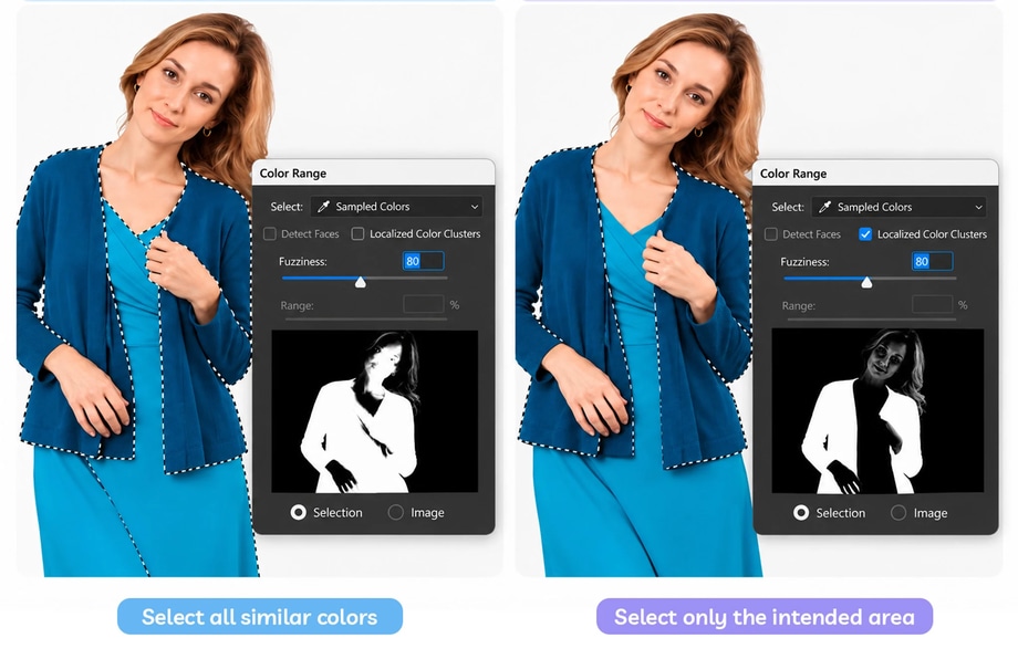
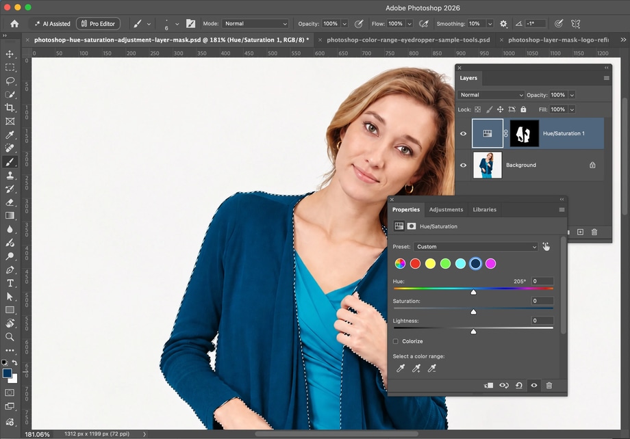
Step 6: Create a Hue/Saturation adjustment layer
Once you’re happy with the selection, click OK.
Now create a Hue/Saturation adjustment layer.
Because you already have an active selection, Photoshop uses it to create the adjustment layer’s mask. The selected area is revealed by the mask while the rest of the image is protected. Adobe documents this selection-to-mask workflow as a way to make targeted, non-destructive adjustments.
This is preferable to permanently recoloring the original image pixels because you can continue changing and refining the result.
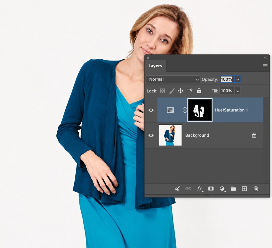
Step 7: Change only the selected color
Select the Hue/Saturation adjustment layer and use the Hue slider to change the selected color.
Because the adjustment is being controlled by your mask, the rest of the photograph should remain unaffected.
Then refine Saturation if the replacement color is too intense or too muted.
Be careful with Lightness. Excessive Lightness adjustments can interfere with the original contrast that gives an object depth. Adobe recommends leaving Lightness at zero when maintaining contrast in this type of object-recoloring workflow.
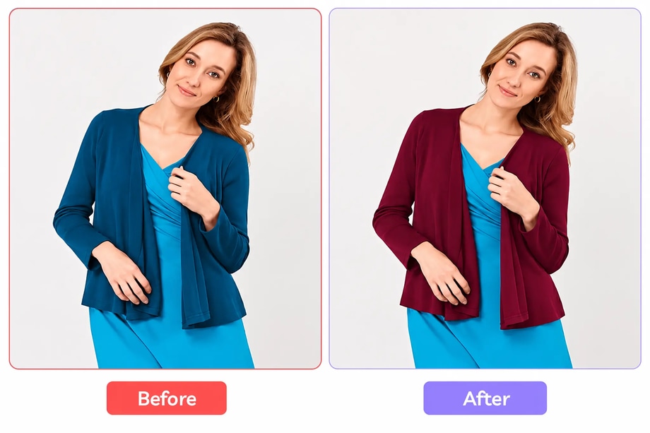
Step 8: Refine the mask manually
Color Range gives you a strong starting point, but don’t expect the automatic selection to be perfect in every image.
Zoom in and inspect your mask.
With the adjustment layer’s mask selected:
Paint black over areas where the new color should be hidden.
Paint white over areas that should receive the adjustment.
Use grey where you need the effect to be partially visible.
Adobe’s layer masks work on exactly this principle: white reveals, black conceals and grey creates partial transparency.
This gives you a second level of control.
Color Range identifies the pixels. The mask lets you decide where the adjustment is actually allowed to appear.
For ecommerce images, inspect areas such as:
- Logos
- Stitching
- Buttons
- Zips
- Metal hardware
- Product edges
- Reflections
- Fine fibres
- Skin or hair beside the product
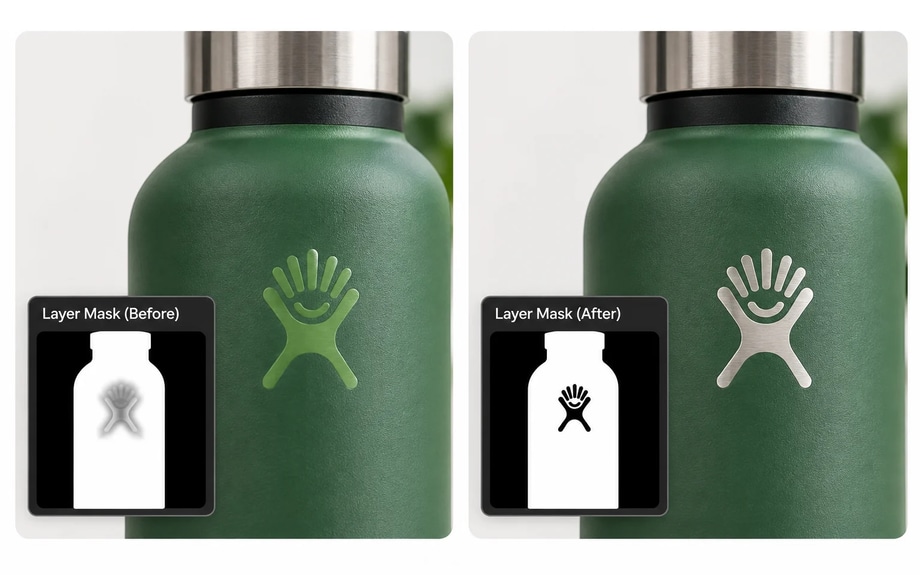
Step 9: Refine the Hue/Saturation color range
There’s another level of control available inside the Hue/Saturation adjustment itself.
Rather than leaving the adjustment set to Master, you can target an individual color range.
Photoshop’s current Hue/Saturation controls include a color range and fall-off system. The inner controls define the range being adjusted, while the outer controls determine how gradually the adjustment transitions into neighbouring colors.
You can also use the Eyedropper controls within Hue/Saturation to sample, add to or subtract from the affected range.
This is particularly useful when your target color sits very close to another color you need to preserve.
But don’t make the range unnecessarily tight. An abrupt transition can create unnatural edges or banding. Adobe specifically uses the fall-off controls to feather the transition between affected and unaffected colors.
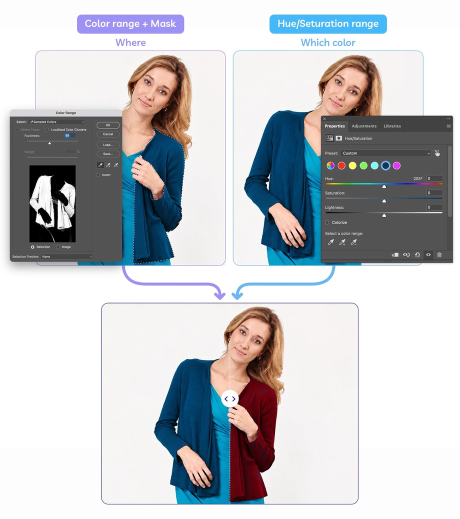
Color Range vs Hue/Saturation color targeting: what’s the difference?
At this point, you might reasonably wonder why we’ve used both. They perform related but different jobs.
Color Range creates a selection based on colors or tones in the image. That selection can then become your mask.
Hue/Saturation color targeting controls which range of colors the adjustment itself responds to.
Using them together gives you two types of control:
WHERE can the adjustment appear? → selection + mask
WHICH colors should the adjustment affect? → Hue/Saturation color range
For difficult product images, that combination can be much more precise than simply choosing “Blues” from Hue/Saturation and moving the Hue slider.
What if the target color also appears inside something you need to protect?
This is where masks become essential.
Imagine a model wearing a blue dress, but her tattoo, eye makeup or another accessory contains similar blue pixels.
Photoshop doesn’t understand the meaning of those objects. It understands pixel information. So if the colors are sufficiently similar, a color-based selection can include both.
Rather than trying endlessly to make Color Range distinguish between visually identical colors, use the layer mask to exclude the areas that shouldn’t change.
This is an important principle:
If two pixels are effectively the same color but belong to different objects, color targeting alone may not be enough. You also need spatial control.
That’s why accurate masking remains so important in professional product editing.
Why are parts of the original color still showing?
If traces of the original color remain after the adjustment, there are several likely causes.
- Your initial Color Range selection may have been too narrow.
- You may have missed darker shadows or brighter highlights when sampling.
- The Fuzziness setting may need widening.
- Or the original product may contain a much broader tonal range than it first appeared to.
Go back to the mask and inspect the problem areas.
You can either refine the mask manually or revisit the color range depending on what’s causing the issue.
Don’t simply increase Saturation to try to cover the remaining original color. That can make the areas already changed look artificial.
Why is Photoshop changing colors I didn’t select?
The reverse can happen too.
If unrelated parts of the image are changing:
- Your Color Range selection may be too broad
- Fuzziness may be too high
- Similar colors elsewhere may have been included
- Your Hue/Saturation color range may be too wide
- The adjustment layer’s mask may need refining
If the unwanted area is completely separate from your product, masking it out is often the cleanest solution.
Remember that the correct target color isn’t enough - you also need the correct target area.
Check your finished color change at 100%
Before exporting, inspect the image at 100%.
Look particularly closely at transitions between the recolored area and areas you’ve protected.
Check for:
- Traces of the original color
- New color bleeding into neighbouring objects
- Colored halos
- Hard or unnatural mask edges
- Changed logos or hardware
- Missing highlights or shadows
- Lost fabric or surface texture
Then zoom out and compare the whole photograph. The objective is not merely to prove that Photoshop changed the correct pixels. The finished object should still look natural.
What about Photoshop’s Adjust Colors feature?
Photoshop’s newer Adjust Colors controls can also identify prominent colors in an image and let you modify their Hue, Saturation and Lightness directly.
Adobe’s current implementation includes an Eyedropper for targeting another color and Color Range controls for refining the affected colors.
For simple images, that can be quicker than building the selection manually.
But the same limitation applies: if similar colors occur in different objects, Photoshop may need additional guidance about where the change should appear.
For precise ecommerce work, inspect the automatically generated adjustment and mask rather than assuming the first result is finished.
Changing one color is easy. Isolating it properly is the skill.
Photoshop gives you several ways to target color, but the most useful way to think about selective recoloring is as a process of sampling the color, refining the range, localizing the target area, making the adjustment, protecting details with a mask, and checking the result at 100%.
You’re not simply telling Photoshop: “Turn blue into green.” You’re telling it: “Turn this range of blue pixels, in this part of the image, into this new color - while preserving everything else.”
That’s the difference between a quick global color shift and a controlled product edit. For one image, you can work through the selection and mask manually.
For an ecommerce catalogue containing hundreds of products and multiple colorways, applying that same level of precision consistently becomes considerably more time-consuming.
Path’s professional color change services can create product color variants while preserving details that shouldn’t change, including stitching, logos, hardware, highlights, shadows and texture.