When it comes to website backgrounds, you may have noticed many brands choose to play it safe. They stick to a plain, white background with black text.
And many online third-party marketplaces also require brands to have a white background (think Amazon and Etsy). However, when it comes to your own website or ecommerce store, brands have a little more room to show off their creativity.
Receive free ecommerce & product photography tips
While the background is just one component of your ecommerce website, the color (or images) you choose matter: One KISSmetrics report shows that 93% of consumers place color and appearance above other factors when making a buying decision. Another 85% state color as the primary factor in their decision to buy a product.
Looking to create or update your site, but aren’t sure where to start when it comes to your background? We’re here to walk you through some options, as well as highlight how to choose the best background for your brand.
Why You Should Consider a Different Website Background Color
First, let’s take a quick look at why you should pay attention to the color you use for your website background. (And no, it’s not just because plain, white backgrounds are a bit on the boring side.)
Color Helps With Targeting and Conversions
Choosing a color for your website background is about more than simply opting for one that looks pretty. There are many other factors to consider, including your brand identity and target customers.
Color in itself has the ability to attract certain types of customers and even encourage them to behave in certain ways.
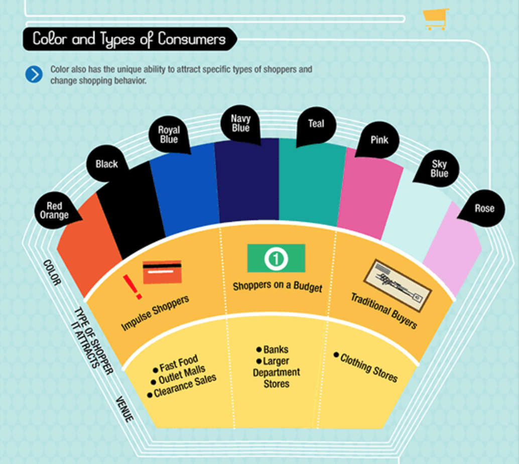
Image: KISSmetrics
Brands can even drill down to using colors based on gender. Studies show that males and females are attracted to different hues: Men are drawn to bolder colors, while women prefer softer tones.
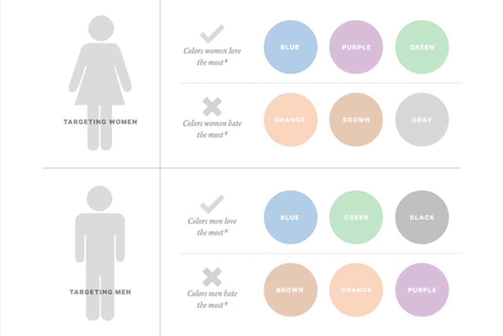
Image: KISSmetrics
So, depending on your ideal customer, choosing one color or palette over another can help catch the consumer’s eye — and turn more of those browsers into buyers.
Other Options for Website Backgrounds
Now that we’ve covered the overall importance of color, let’s look at it in the context of website backgrounds. Generally, the background is the dominant color on your site — it sets the visual tone for the rest of the experience, at the very least.
And while your website background is only really limited by your own imagination, here are a few of the most common types you’ll see brands sporting in 2018 and beyond.
Dark Backgrounds
You’ll start to notice that more and more brands are opting for a darker aesthetic for their website. They’re leaning on black and dark gray hues to set the tone. Rather than coming across as drab and severe, dark backgrounds can be the perfect canvas for beautiful images and/or products that pop off your page.
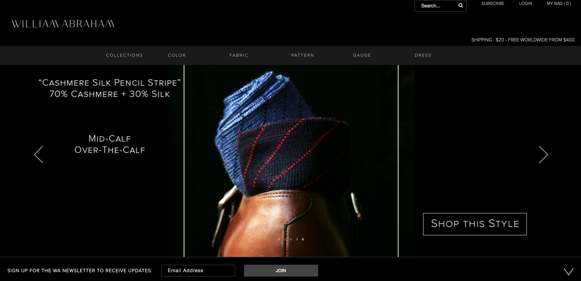
Image: William Abraham
Dark backgrounds can offer a brand an elegant, sleek look for their website — particularly when paired with crisp, high-resolution images like in the above example.
Light or Natural Backgrounds

Image: Industrial Facility
Rather than relying on stark white, some brands are trying out off-whites and more neutral colors for their website background.
Lighter backgrounds, including beiges and earthy neutrals, offer the same kind of versatility as white but with a little more personality. The hint of color draws the eye while still letting images and products steal the spotlight.
The light tones include various neutrals like light grays, browns, off-whites, greens and blues.
Image-Based or Textured Backgrounds

Image: Artifact Coffee
You also have the option of more subtle patterns for just a hint of something in the background:
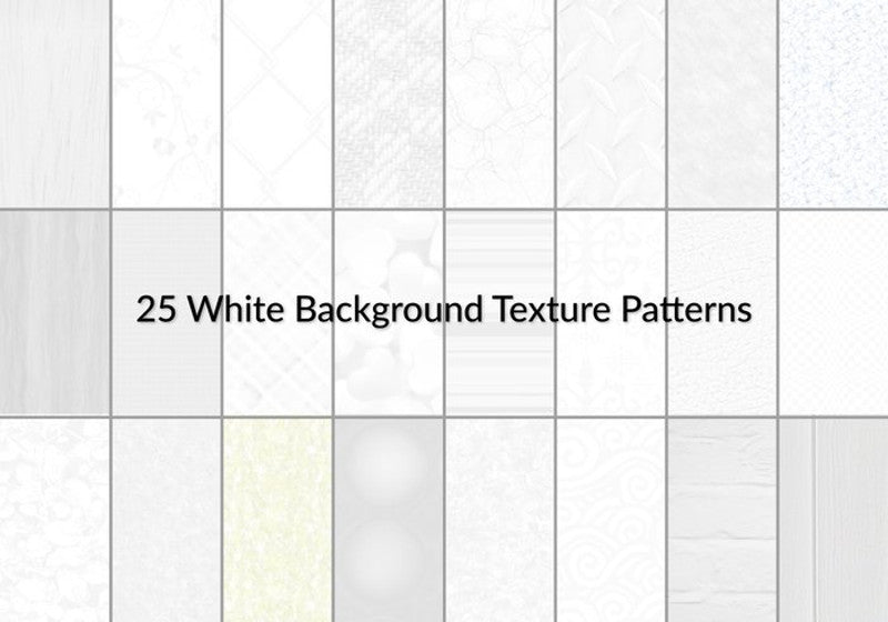
Image: wpeka
How to Choose to Right Background for Your Brand
Use the Right Tools
To start on your quest to find the perfect background for your brand’s website, it helps to begin with the right tools to ensure your success.
We’ve all probably seen a few sites with multiple bright colors used together (neon green and fluorescent pink, anyone?) or with an obnoxiously distracting image in the background. Or you may have seen sites where the font color is too close to the background color, making it impossible to read the copy. While you may be aware of some of these common design faux pas, it isn’t easy to create a background that follows all the rules.
In other words, if you don’t have a design background, picking and choosing colors and textures can feel like a daunting task.
However, you don’t need to be a design master to pick a palatable palette. If you’re aiming to pick a color or a palette, there’s no need to be a seasoned designer to pair up stunning colors: just use one of the following palette generators:
For images, there are multiple free stock sites brands can check for relevant photos that would work well as a site background:
For textures and backgrounds, try one of the following resources:
Make Sure Your Website Background Reflects Your Brand
Brand recognition, which links directly to consumer confidence, increases by 80% when the right colors are used, according to the KISSmetrics report we mentioned above.
It’s integral that whatever you choose for your website background should be cohesive with your brand. That means using the colors that you already use elsewhere for your brand, whether that be on social media, in a brick-and-mortar store or pop-up shop, or another branded website.
For example, if your brand is more formal or corporate, it doesn’t make sense to use a playful or edgy background.
Website Builder Expert recommends ecommerce sites to stick with neutral backgrounds, since it’s usually heavy with graphic elements (like product images and descriptions). This will help your products shine. But, if you’re in the fashion or design industries, you could play around with more out-of-the-box backgrounds. Try photography, textures, videos or patterns as a website background.
Moving Forward With the Right Background for Your Website
Now that you have a better understanding of the ins and outs of color and the role it plays on your website background, you can make a more informed decision that can benefit your brand in the long run.


