Whether you’re just getting started selling online or looking for a new place to set up shop, Etsy is one marketplace you need to pay attention to.
As a space where folks buy and sell handmade items and craft supplies, Etsy has grown from a respectable merchandise sales volume of $170,000 in their first year (2005) to an incredible $3.9 billion in 2018. Last year alone, they had 39.4 million active buyers — that’s a lot of people looking to spend their cash on jewelry, vintage goods, clothing, art and other handmade treasures.

With stats like those, the Etsy marketplace might just be the perfect place for you, but there are a few things you need to know first.
If you’ve got handmade goods, vintage treasures, or a wealth of craft supplies to sell, and you want to get your Etsy photos right, read on.
Why are product photos so important?
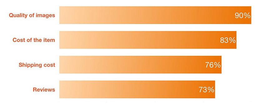
When it comes to making buying decisions, 90% of Etsy shoppers say that the quality of the product photos is a very important part of their buying decision. That means even if you’ve made the greatest piece of art of all time, if the photos aren’t very good, no one can appreciate it — let alone buy it!
Take the time and effort to go the extra mile with your Etsy product photos — your sales numbers will thank you for it.
Want to sell BIG on Etsy? Great! Here are the tips and tricks you need to to optimize product images for Etsy.
Etsy product photo guidelines
Like any third-party marketplace, Etsy has guidelines that your photos have to or should abide by. Use photos that are at least 2000px wide. This allows the buyer to zoom in and see details. Don’t worry about the thumbnails — Etsy will automatically resize the images for you.
- Maximum product photo file size: 20 MB
- Product photo file type: .jpg, .gif and .png
- Product photo image size: at least 1000 px square
If you use photos that are at least 1000 px wide, Etsy will automatically enable the zoom feature. They recommend sellers use consistent sizing in your product photos, as this creates a better user experience for shoppers.
You get up to ten product photos for each product, and Etsy recommends you use at least five. The first photo should be landscape or square, as Etsy uses this as the focal point for the image appears appropriately in cropped thumbnails. They also recommend you convert images to sRGB.
Etsy product photography tips
- Plan ahead
- Say goodbye to the white background
- Keep it neat
- Let the sun shine in
- Forget the flash
- Compose artfully
- Back up
- Get close
- Don’t distract
- Play with depth of field
- Keep it cohesive
- Clean edits only
- Prop it up
- Keep the buyer in mind
- Tell a story
- Make it fashion
- Let the product be the star
- Capture all the details
- Show your work
- Share your special touches
Plan ahead
Don't leave the quality of your photos to chance — take time beforehand to think about what kind of setting your items will look best in. Do you want to shoot them indoors or outdoors? Do you want a simple background or would you prefer a lifestyle photo setting with a model? Whatever you decide, take the time to think about it beforehand so your life will go that much easier come photoshoot day.
You also want to think through how the day will go. "Have a futuristic sense of how you're going to get this done," high-end jewelry brand Claurete founder Carla Kabbabe told us. “Working with that mindset help you eliminate the chances of something going wrong and makes it easier for you to get the most out of the photoshoot.”

Say goodbye to the white background
If you've prepared photos for Amazon before, chances are good you’re used to shooting on a white backdrop with a certain style of lighting. You don't have to do that for Etsy. In fact, I don't recommend it. When it comes to handcrafted items, people want to see a little more whimsy and creativity in product photos.
That doesn't mean taking the photos has to be difficult, though. You can still use a simple backdrop setup. Shoot on backgrounds you have around the house (like a great marble countertop or beautiful rustic tabletop) or set yourself apart with these background ideas.
Want one extra reason to differentiate your photos from those that are shot for Amazon? If your product looks like it's available on Amazon, people might cross shop to get a better price. That means they'll leave your Etsy shop and go look for something cheaper. When that happens, they usually won't come back, so set yourself apart and make unique product photos.
Keep it neat
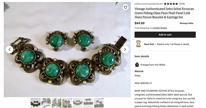
This probably goes without saying, but neat, clean items sell so much faster than ones with water spots or fingerprints. Wipe down your product one last time before you ever click the shutter. You’ll thank yourself later when you don't have to clean up any dust or smudges in Photoshop. (You can outsource that too.)
We love how clean this jewelry looks, from Sarah’s Vintage Baubles Etsy shop:
Let the sun shine in (but not too much)
When you're setting up to shoot, remember that on Etsy, natural light wins the day. Place your items in open shade — meaning next to a large window or somewhere that is completely shaded such as a covered patio.
Full sunlight will give harsh highlights and dark shadows, but open shade will give you a natural, soft light that shows off all the details while giving more of an authentic look to your item than harsh studio light does. If you're not happy with the shadows in your shot, you can add a natural shadow in Photoshop during post-processing.

Once you've got your item in open shade, figure out where the direction of the light is coming from, then place a large white reflector opposite that. You want to bounce back the light on to the shaded side of your item so all the beautiful details can be captured in their glory. Too much shadow is a bad thing, so play around with the reflector and location of the item until you get this perfect.
Forget the flash
Flash photography is good in many situations, but this isn’t one of them. Turn your flash off and meter for a proper exposure without it. Flash can blow your highlights and clip your blacks, and it can even change the appearance of the color of your item if you haven't compensated with your white balance.
When it comes to selling online, inaccurate color is a sure way to get unhappy customers, so leave the flash off for the most realistic result. Sometimes people get frustrated by this tip because they can't shoot late in the evening, but unless you’ve mastered off camera flash and white balance, it's definitely worth it to wait until the next day.
Compose artfully
Composition matters. Again, in an Amazon-type situation, you want your item front and center and to fill most of the frame. That's not necessarily the case on Etsy.
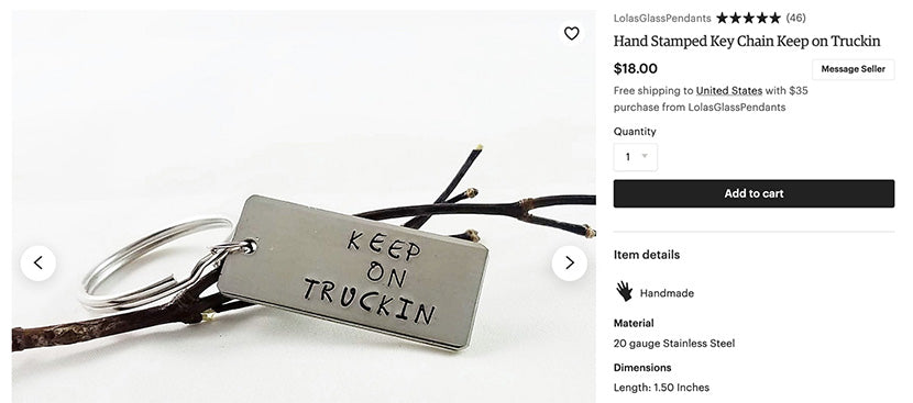
Great news! This allows you to get creative. Use composition tools like leading lines or the rule of thirds to see what highlights your product best. Have fun with it! Lola’s Glass Pendants uses fun props to highlight their jewelry and give product shots an artful aesthetic.
Back up
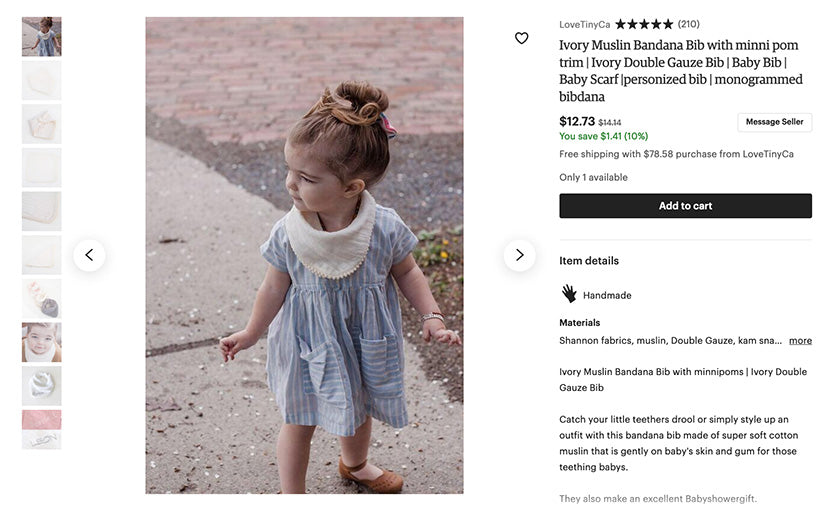
You want to show your product in its entirety, and you can show it in an appropriate setting, too. While most fashion brands use plain background shots, lifestyle or contextual pictures can give shoppers an idea of what the product would be like in the real world. This is especially helpful for unique crafts, gifts, and items common to Etsy.
For example, if you're making hand-painted ceramic coffee cups, you can show it on a desk next to a plate of donuts or full of steaming hot coffee in someone's hands. Take a step back and see what kind of setting your product fits into naturally.
Love Tiny Ca shows how this children’s bandana looks on a live model:
Get close
Once you've done that, step forward again and let the product fill most of the frame in the same setting. This lets people get a good look good close look at the item while still understanding the setting you created. Here’s the same product from the example above (in a different setting):
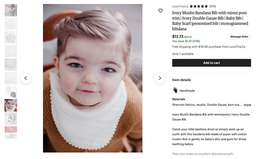
Finally, step in one more time. Let the product fill the frame entirely. People love to see the tiny little elements that let them know the product is truly handmade or vintage. Showcase them with a nice tight composition.
Don’t distract
No matter what setting or background you choose, make sure that there are no distractions. If you’re showcasing a coffee cup on a desk in an office, make sure that the monitor behind it is off, so there's no distracting images pulling would-be buyers eye away from your fantastic mug.
Likewise, if you're using a patterned backdrop or a very simple background such as newspaper, make sure there’s no text that distracts or design elements like swirls that will pull the buyer’s eye away. Keep all eyes on your goodies!
Play with depth of field
When it comes to creating product photos for Etsy specifically, a shallow depth of field is one of the best things to employ. Instead of making sure you have a small aperture like you need for an Amazon photo, you can open up and use 5.6, 4.0, or even 2.8.
In this HelloRing listing, the main photo does a great job of drawing attention to the stone in the ring even though the background is nice and vibrant. They achieve this a shallow depth of field.
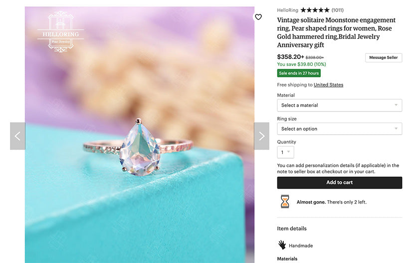
Open up until you’ve got something that’ll give you nice crisp focus where you want it and let everything else blend into a creamy bokeh in the distance.
Do you HAVE to use shallow depth of field? Absolutely not, but it lends an aesthetic vibe that Etsy buyers generally appreciate, so you might as well give it a shot. (No pun intended!)
Keep it cohesive
Whether you're selling paintings, necklaces, or old guitar picks, you want people to know right away that an item is your item. There's no better way to do that than to create a cohesive look for your shop.
If a buyer wants to look for more than one item, or if the item they want sold out, they’ll go to the main page of your shop. If they click over there and it looks like a mishmash, they’ll be confused and go elsewhere.
Whether it's the vibe, the color, the models, the composition, or something else of your choosing, make sure you include some unifying element so that people know they’re in the right shop right away.
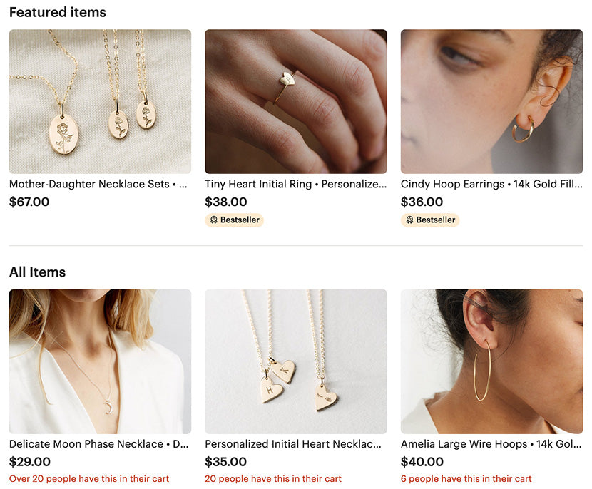
Check out how GLDNxLayeredAndLong does it. Though there’s a mix of lifestyle and plain background, all of their photos have similar colors. The overall look and feel is consistent.
Clean edits only
When you sit down to edit your photos, you might be tempted to get creative in Photoshop as well. After all, I've told you several times so far to get creative and have fun, right? This doesn't count in the editing room, though.
Instead, you want clear, clean, crisp edits so that the item’s colors, textures, and features show up properly. If you play too much with white balance, for example, you’re likely to get returns from the buyer who wanted a teal -shirt but wound up with a blue one.
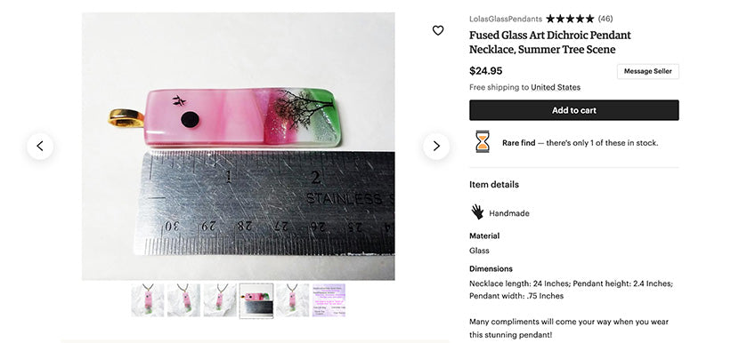
No time to mess with editing? Outsource it so you can skip this tedious step and get back to what you enjoy. If you really want to make your product photos shine, you can use props to display your items in a more dynamic light. Balance crystal clusters next to a small statue of a unicorn, or layer a set of sparkly earrings on a bed of feathers. Check out how a few flowers elevates this shot of a doormat for DoorMatters: Use unexpected items to grab the viewer’s attention so they want to take a second look at your merchandise. Adding charming props helps them to fall in love with the photos AND your goods. Imagine this setting for a second: black leather furniture, bright chrome accents, shiny marble floors. When you imagine that, what kind of person do you think would live there? Probably an urban bachelor, right? Would you put a diaper bag in a room decorated like this if you’re trying to sell to a Southern suburban mom? Probably not. She’s more likely to envision herself in a setting with traditional or farmhouse decor. And you definitely want viewers to envision themselves interacting with the product. Keep the buyer in mind when creating the setting, composition, and accessories for your shoot. If you can make it look like a page out of their life, they’ll be that much more inclined to buy. This brings me to my next point… Use your images to tell a story. Remember the coffee cup example from up above? What kind of person is using this coffee cup? Is it a female entrepreneur, or a world's best grandpa? Whoever it is, imagine the setting and style in which they’d be using it. If that cup is for Grandpa, maybe it's next to a newspaper. If it's for a female entrepreneur, however, it's probably going to be sitting next to her shiny Macbook and a plate of macarons. Lifestyle product photography has made a huge difference for Etsy store Little Goodall. Having reached more than 20,000 sales on her store, founder Molly Goodall credits a lot of her success to this visual approach. Of her old, human-less shots, she says, “It's a miracle I sold anything from those photos. They were missing the key component of what brings the garments to life: a child.” Use the background and other items in the image to tell a story about the product and who it's for. If shoppers can see themselves using it, they'll find it hard to live without it. One more way Etsy photos are different than Amazon photos is that you can use models whenever you want. For some item categories, using models is recommended, even. And in our analysis of the top 25 fashion brand websites, we found that nearly 62% of product photos feature people. After all, how can someone imagine what a necklace would look like when it's laying flat? Models help you show the image in its best light and create the story we were just talking about. This doesn't have to be expensive or difficult either — you can recruit a friend or family member to help you out. (Bonus points if have a fresh manicure.) By this point, you might be tempted to make super creative, artistic photos — that’s great! Digging in and getting creative feels good and helps you become a better photographer in the end. One seller that does a great job of this is Chelseasflowercrowns — her photos show all the intricacies that go into her pieces. Remember not to get so far out there that the image loses context. Remember this is a product photo for Etsy, not an editorial spread for Vogue. Let the product be the star of the image so people know exactly what they’re buying. No matter what story you decide to tell, make sure you capture crisp, clear details and all the little elements that make your Etsy products special. Lola’s Glass Pendants takes this quite literally when showcasing the size of their products: Let’s face it — buyers don’t always understand the care and effort that goes into creating handcrafts. Give them a peak with process photos. The next time you're creating one of your wonderful products, snap a few photos along the way. Then process the images with the same editing style as the rest of your photos and insert them with the listing of the item itself. Once people see all the hard work you put into creating, they'll appreciate your goodies that much more. Etsy is a huge marketplace for gifts. Whether you’re buying something for a friend or treating yourself to a little something special, everyone loves receiving specially wrapped packages, right? From ribbons to stickers, tissue paper to fancy boxes, show off the extra touches you add to their experience and they’ll be that much more inclined to choose your shop when it’s gift-giving time. Bonus points if you show your items all wrapped up — when they see that photo, they’ll imagine having that present in their hands, and that kind of imagination is a powerful motivator to BUY NOW! There you have it: important tips and tricks for putting your best photographic foot forward on Etsy. When you’ve added your new and improved product photos, people will truly be able to appreciate the effort you’ve put into the photos and the products themselves.
Keep your edits clean — you won't regret it.
Prop it up

Keep the buyer in mind
Tell a story

Make it fashion
Let the product be the star

Capture all the details
Show your work
Share your special touches
Moving forward with your Etsy product photos


