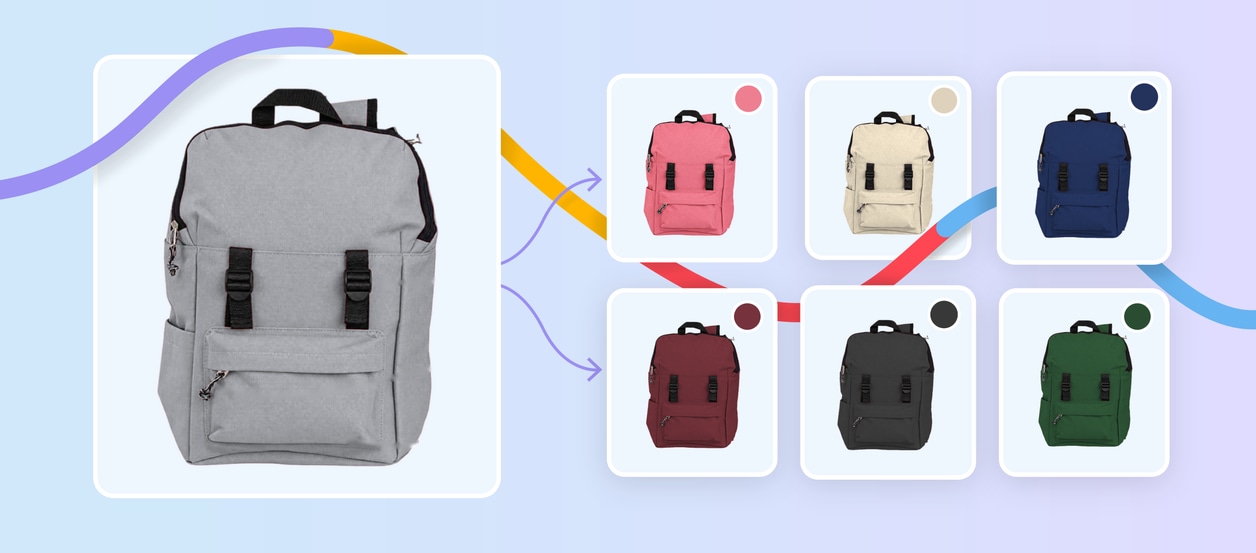
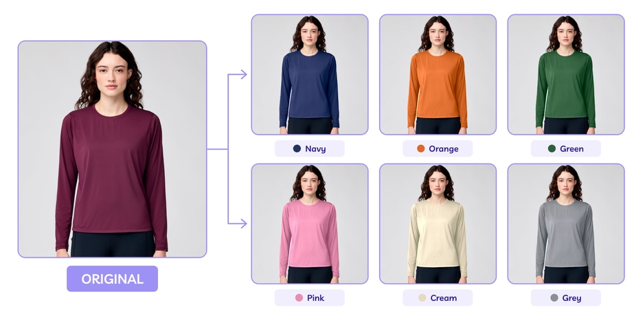
Imagine you’re launching the same T-shirt in eight colors. You could photograph every color separately. Or, if the product is otherwise identical, you could photograph one version and create the additional color variants in post-production.
This approach can be particularly useful when you have lots of SKUs, limited physical samples or new colorways that weren’t available during the original photoshoot.
But creating convincing product color variants involves more than duplicating an image and moving the Hue slider.
You need the right master photo, reliable references for each target color and a consistent editing and quality-control process.
Here’s how to turn one product photo into multiple ecommerce-ready color variants while keeping the product itself consistent.
What are product color variants?
Product color variants are different color versions of the same underlying product.
For example, a retailer might sell the same T-shirt in:
White / Black / Navy / Burgundy / Forest Green / Grey
If the garment’s material, construction, stitching and other physical details are identical, the different options are essentially colorways of the same product.
Instead of photographing each one separately, a high-quality master photograph can sometimes be professionally recolored to represent the additional variants.
Color change editing is appropriate when the product genuinely remains the same apart from color. It shouldn’t be used to disguise physical differences between SKUs.
We’ll come back to that later.
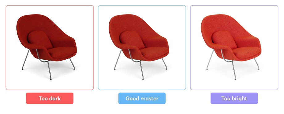
1. Choose the right master product photo
The quality of every variant starts with the image you choose as your master.
Ideally, it should be:
- High resolution
- Sharp and properly focused
- Well exposed
- Evenly and consistently lit
- Free from unwanted color casts
- Detailed enough to show texture
- Clean around the product edges
You also want useful tonal information in both highlights and shadows. If you’re choosing between several source colors, don’t automatically assume that any one will work equally well.
An extremely dark product can hide detail in its shadows. A very pale product may contain limited contrast. Depending on the product and the target colors, a well-exposed mid-tone variant can sometimes provide more usable information for recoloring.
2. Confirm that the variants really are identical apart from color
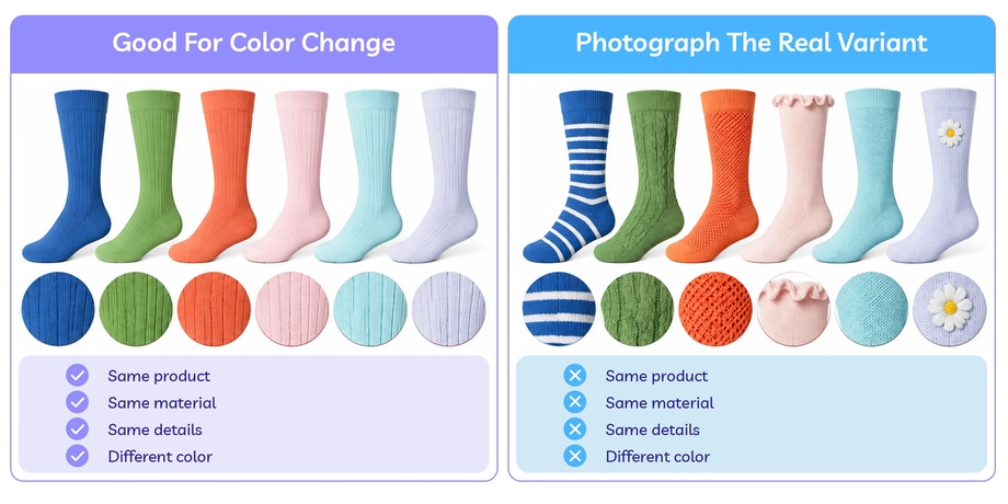
Before editing anything, compare the actual SKUs. The only meaningful difference should be the color.
Check:
- Material
- Texture
- Pattern
- Stitching
- Hardware
- Buttons
- Labels
- Logos
- Trim
- Construction
- Transparency or finish
Imagine a handbag available in black, tan and burgundy. If every version uses the same leather, stitching and gold hardware, creating variants from a master photograph may make sense. But if the black version has silver hardware or the tan version uses contrast stitching, a simple global recolor won’t accurately represent those products.
Those differences either need to be edited deliberately using reliable references or the actual variant should be photographed.
3. Gather a reliable color reference for every variant
Don’t create the new colors from their names alone.
“Green” could mean:
sage / olive / emerald / forest / mint / khaki
And “beige” could cover an equally broad range.
If the edited image is representing a genuine SKU, use the best reference available for each colorway.
That might include:
- The physical product
- A manufacturer-approved image
- A material or fabric swatch
- An approved product specification
- A reference captured during photography
Create a simple variant list before editing.
For example:
| SKU | Product | Color | Reference |
|---|---|---|---|
| TS01-NV | Classic T-shirt | Navy | Approved fabric swatch |
| TS01-BG | Classic T-shirt | Burgundy | Physical sample |
| TS01-FG | Classic T-shirt | Forest Green | Manufacturer reference |
| TS01-GY | Classic T-shirt | Grey | Physical sample |
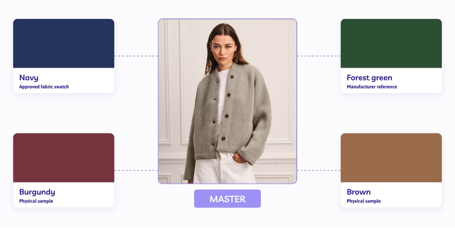
That gives the editor a defined target rather than asking them to create four subjective interpretations of a color name.
4. Isolate the part of the product that should change
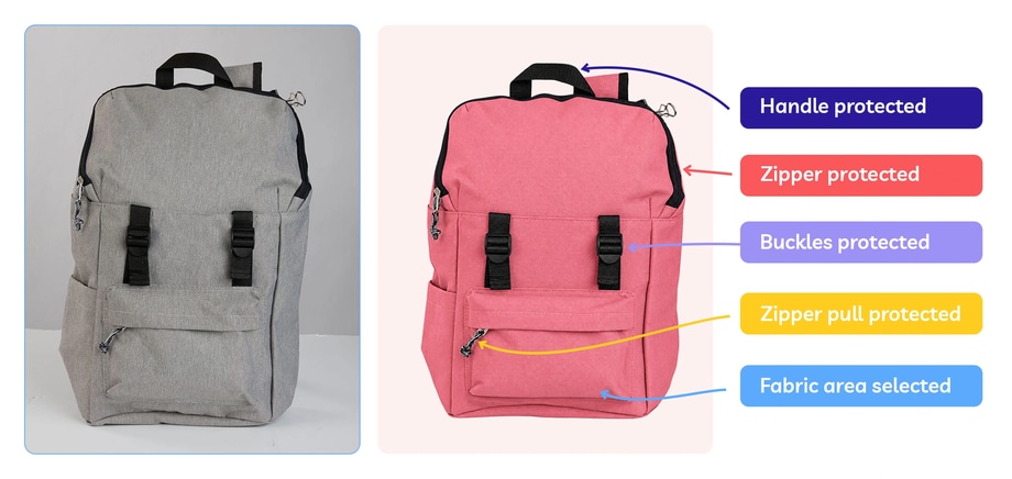
Next, create an accurate selection or mask around the area being recolored.
This matters because not everything in the photograph should necessarily change.
For a shoe, you may want to recolor the upper while preserving:
- Sole
- Laces
- Eyelets
- Logo
- Stitching
For a chair, perhaps the upholstery changes but the wooden legs remain identical.
For clothing, fabric may change while buttons, zips and branding remain untouched.
Creating an accurate master mask can make the rest of the variant workflow much more efficient because the same isolation can then be reused across the additional colors.
5. Create the first new color variant
Now create the first recolored version.
In Photoshop, this might involve a Hue/Saturation adjustment layer, masks and additional tonal adjustments depending on the source and target colors.
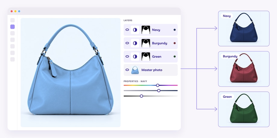
We’ve covered the Photoshop process in detail in How to Change Color in Photoshop: A Step-by-Step Guide.
For the first variant, check:
- Does the target color match the approved reference?
- Are the original texture, shadows and highlights still visible?
- Have any details changed that shouldn’t have?
- Does the product still look three-dimensional?
Once you’ve established a reliable editing approach, you can use the same underlying master image and mask to build the remaining variants.
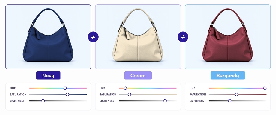
6. Don’t use exactly the same adjustment for every color
Creating six colorways doesn’t necessarily mean creating one adjustment and simply entering six different hue values.
Different target colors may need different treatment.
For example:
- A dark navy may need different tonal handling from pale cream
- A saturated red may behave differently from muted sage
- Black may need additional work to retain visible detail
- White or very pale variants may require careful highlight control
The product should remain consistent, but the editing settings don’t have to be identical.
Judge each colorway against its reference and against the physical characteristics of the product.
7. Keep the product position identical
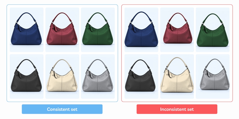
One of the biggest advantages of creating color variants from the same master photograph is visual consistency.
Because the source image doesn’t change, each finished variant can retain exactly the same:
- Product position
- Crop
- Scale
- Angle
- Shape
- Lighting
- Shadow placement
That makes switching between colors much easier to compare visually.
When a customer switches between colorways, the product should remain in exactly the same position, scale and angle.
Using the same master image removes many of the small inconsistencies that occur when each colorway is photographed separately.
8. Repeat the same views across each colorway
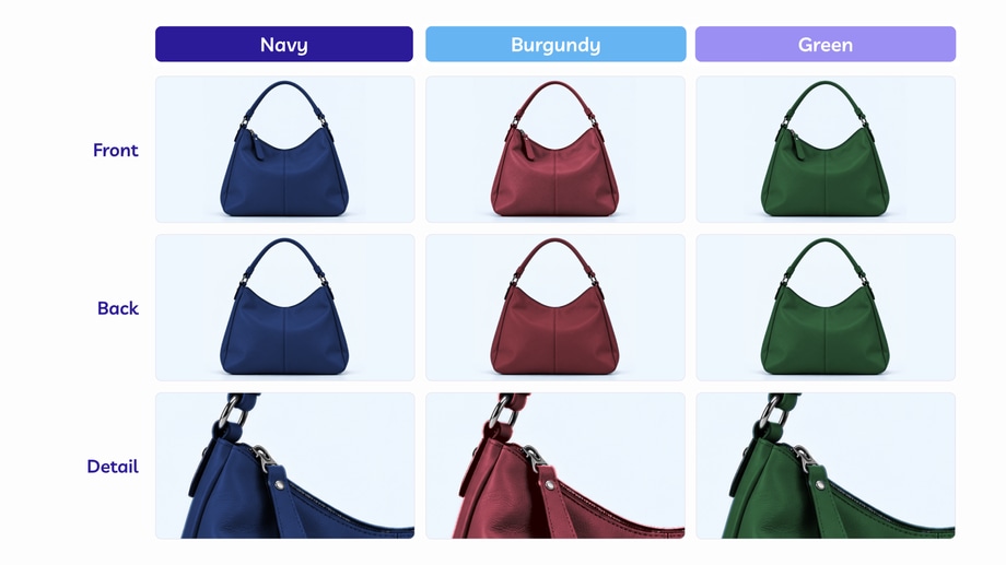
One master photo can create several colors of that particular view, but that doesn’t necessarily mean one photograph is enough for the entire product listing.
An ecommerce product may need:
- Front view
- Back view
- Side view
- Detail image
- Close-up
- On-model image
- Contextual or lifestyle image
If you need each colorway represented across several views, the same principle can be applied to each master view.
For example:
- MASTER FRONT → six front color variants
- MASTER BACK → six back color variants
- MASTER DETAIL → six detail color variants
This creates a complete, consistent image set for every color option.
9. Use a clear file-naming system
Once you start multiplying products by colors and views, file organisation matters.
Imagine you have 100 products × 6 colors × 4 views. That’s a total of 2,400 finished images. Names such as final-image-2-new.jpg won’t help much.
A structured naming convention can identify the product, variant and view.
For example:
- TS01-navy-front.jpg
- TS01-navy-back.jpg
- TS01-burgundy-front.jpg
- TS01-burgundy-back.jpg
The exact convention isn’t important as long as it’s consistent, unique and understandable to the people and systems using the images.
If your ecommerce platform, DAM or PIM has specific naming requirements, build those into the workflow before editing begins.
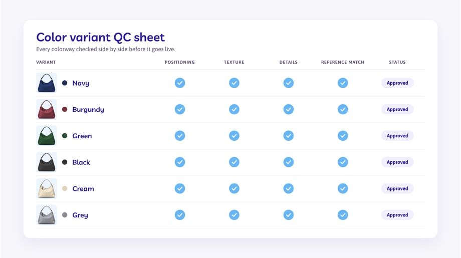
10. Review every variant as a complete set
Don’t approve color variants one by one and assume the catalogue will work when they’re put together.
Review them side by side.
Check:
- Is the product identical in shape and position?
- Are all approved colors represented?
- Do any variants look unnaturally saturated?
- Is texture equally believable across the set?
- Are highlights and shadows consistent?
- Have logos, stitching or hardware changed accidentally?
- Do dark colors retain enough detail?
- Do pale colors retain enough contrast?
- Does each variant correspond to the correct SKU?
This is where inconsistencies that looked insignificant in isolation become obvious.
11. Check the variants on the product page too
The editing workflow doesn’t end when the image files are exported.
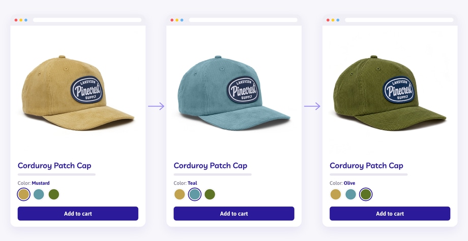
Check how they actually appear in the ecommerce experience.
For example, when a shopper selects Forest Green:
- Do they see the Forest Green product image?
- Does the swatch correspond to the right image?
- If the product has several images per color, are they associated with the correct variant?
- Does switching colors produce a consistent gallery rather than mixing photographs from different colorways?
Image organisation and variant mapping are part of the customer experience, not just back-end housekeeping.
How many product color variants can you create from one photo?
Technically, you could create many. The real limit is whether each finished image can still accurately represent a genuine product option.
If one master photograph can be turned into ten accurate variants, there’s no inherent reason to stop at three.
But each version still needs:
- A genuine corresponding product color
- A reliable reference
- Realistic texture and lighting
- Correct product details
- Individual quality control
When shouldn’t you create variants from one photo?
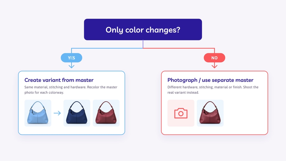
One master image is not always the right solution.
Photograph the actual variant or create a separate master when differences extend beyond color, including:
- Different materials
- Different patterns
- Different finishes
- Different hardware
- Different stitching
- Different construction
- Different transparency
- Physical design changes
The same applies if the source photograph doesn’t contain enough visual information to create a particular target color convincingly.
A black product with almost no visible shadow detail, for example, may be a poor source for creating a pale cream version.
Editing should support an accurate product representation, not force every SKU into the same workflow.
One master image. Multiple consistent colorways.
Creating product color variants from one photo works when the underlying product is identical and only the color changes.
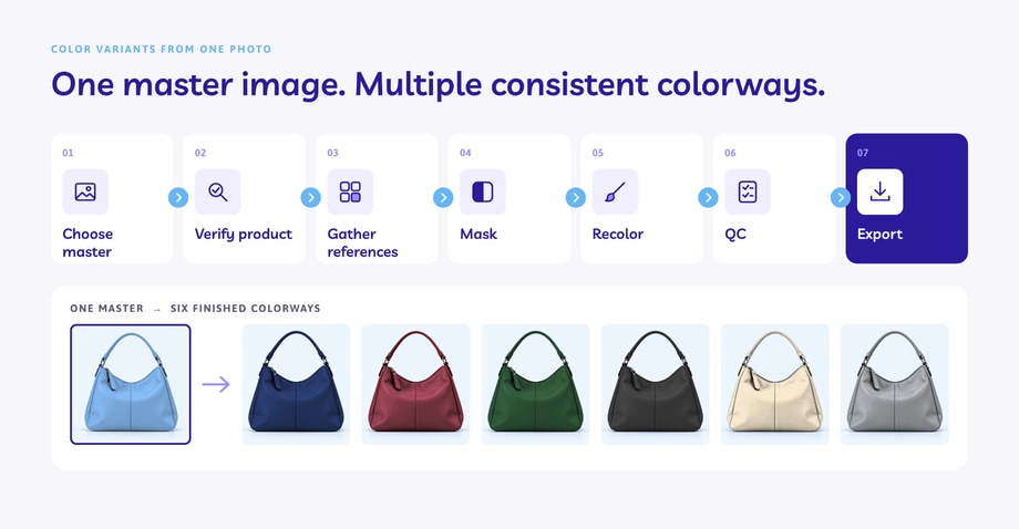
Each finished variant should represent the correct color while preserving the same product shape, texture, details, lighting and positioning.
For larger ecommerce catalogues, Path’s professional color change services can apply this process consistently across multiple products and colorways.