Photography is the cornerstone of your ecommerce biz, especially in a COVID economy where in-person shopping happens less frequently. When customers can’t physically touch your products, all they have is the photos and accompanying descriptions.
Receive free ecommerce & product photography tips
But this can work in your favor. MIT neuroscientists found the brain can identify images seen for as little as 13 milliseconds. You don’t need a whole store—you just need amazing product images.
Photos can make (or sometimes break) ecommerce conversions. Here’s how to make sure you’re optimizing your product photography for best results during the photo editing process.
Fix any Photoshop fails
Pesky Photoshop fails can happen to the best of us. So it’s important you have the right fail-safes in place to avoid them.
Look for details when combining multiple photos
When merging photos, it’s easy to miss a few overlaps.
Sometimes you don’t quite capture the perfect photograph in one shot, but rather certain elements in a few photos would make the perfect frame. So, instead you opt to Photoshop those elements together. If that’s the case, just be mindful you catch all the potential faux pas — direction of feet, extra hands or limbs, disproportionate limbs — before publishing.


Pay attention to ghost limbs
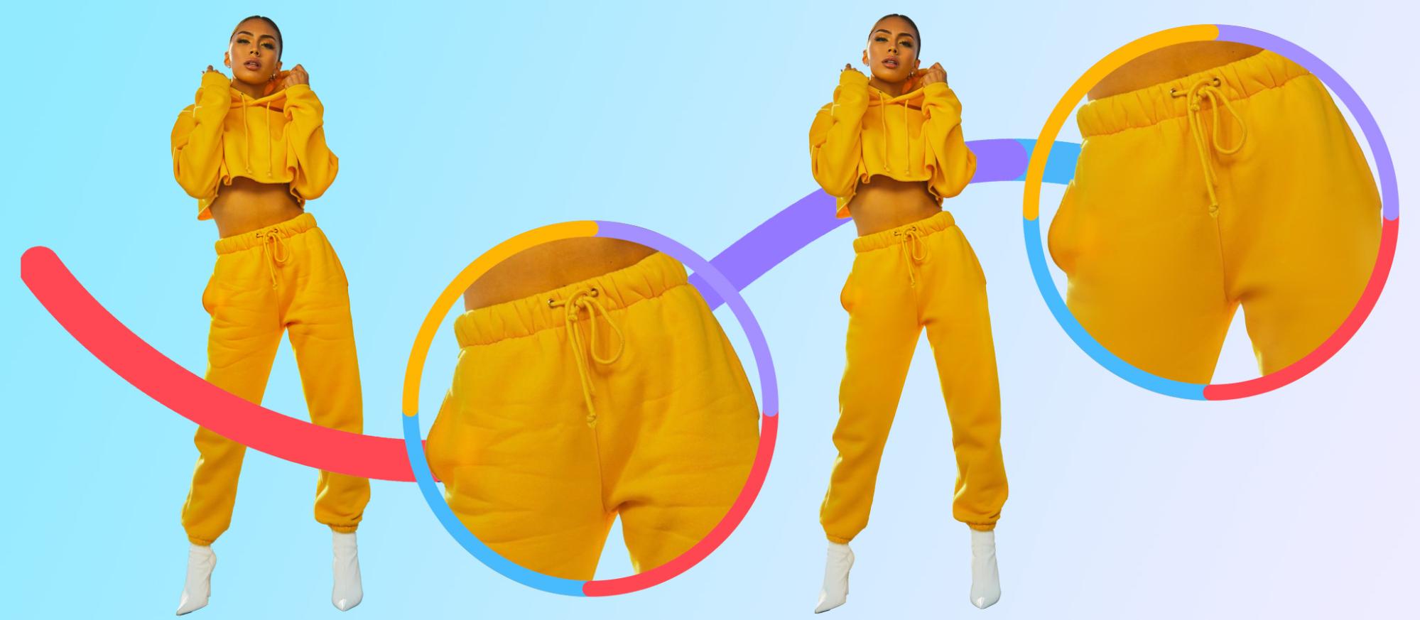
Our analysis shows that 12% of product photos use invisible mannequin. It’s a great way to bring apparel to life and avoid flat, lifeless product imagery. But it’s also a great way to get limbs without a head to match.
If you’re ghosting mannequins, make sure they don’t fall victim to phantom limb syndrome, which you can see below. If you can’t show a real human modeling the clothes, that’s okay, just make sure you remove all human parts. Otherwise it could be kinda weird.

Look at your fake reflections
If you’re combining photos or removing some items from existing photos, remember to check reflections. Reflections are weird lighting effects that often happen with mirrors or liquid, like a swimming pool, glass of water, etc.
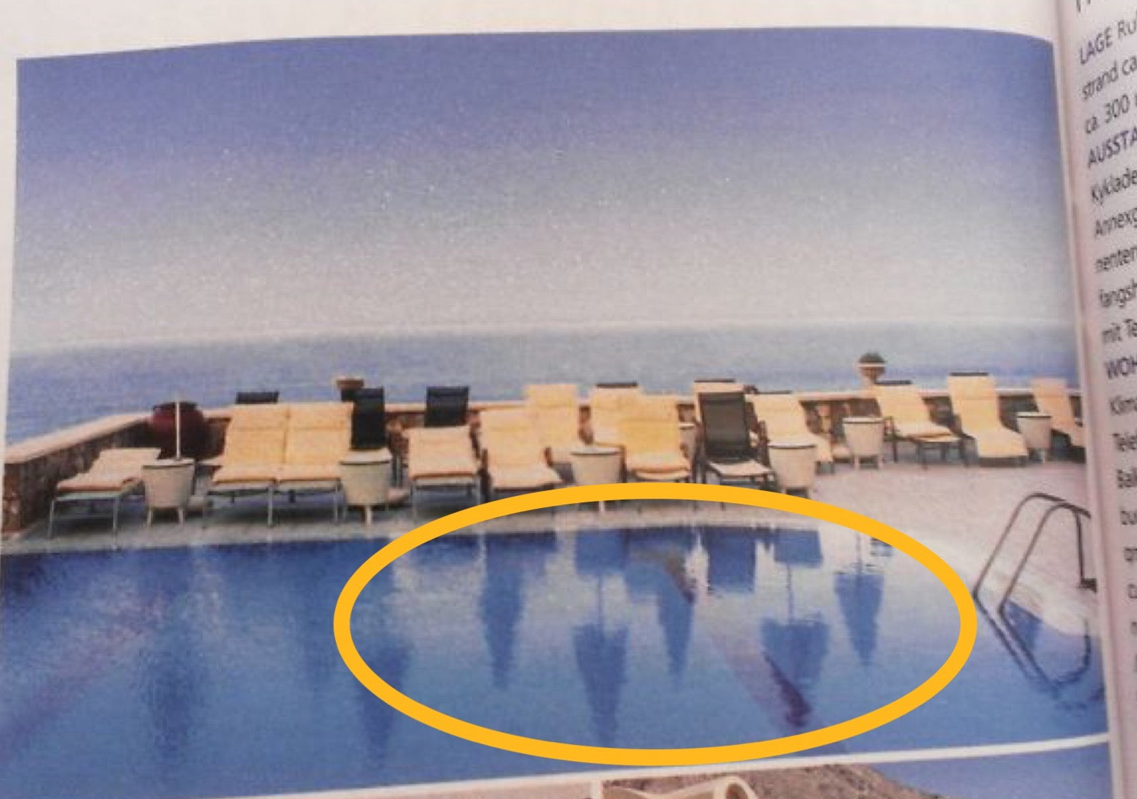

Here’s a tutorial on how you can vanish unwanted elements from your photos using Photoshop CC, Photoshop Elements, or GIMP.
Add or remove reflections
Speaking of reflections, it can be difficult to photograph certain items that have reflective surfaces, such as sunglasses, jewelry, glass, and metals. Reflections can distract from the actual product and therefore decrease conversions (aka sales).
If your products have a naturally reflective surface, the following video tutorial will help you understand how to better photograph these products from the get-go:
Sometimes, though, we want to add reflections for dramatic effect or to draw customers’ eyes to a certain element in the image. If that’s the case, you can use this tutorial about how to make a reflection in Photoshop.

Direct models’ focus on the product
Lifestyle shots featuring models help the customer envision what life would be like with your product. Whether it’s clothing, electronics, jewelry, or even furniture, this can be a great way to really drive it home.
In fact, our analysis shows that 62% of apparel product photos feature people. So if you’re opting to feature people in your product photos, directing models’ focus on the actual product can help increase conversions.
What do we mean by directing a model’s focus on the product? They could be looking or pointing at the item or using body language and gestures. Oui The People, which sells razors, shows an image of a model looking at the razor while in use.

According to Conversion Sciences, we’re actually “hard wired to follow other people’s gaze,” as proven by an eye-tracking study from reviewing 29 eye-tracking heatmaps. The heatmaps show that when there’s no human in the photo, viewers tend to spend little time on the image and instead focus on the copy. Even original research conducted by ConversionXL confirms visual cues can vastly improve conversions.
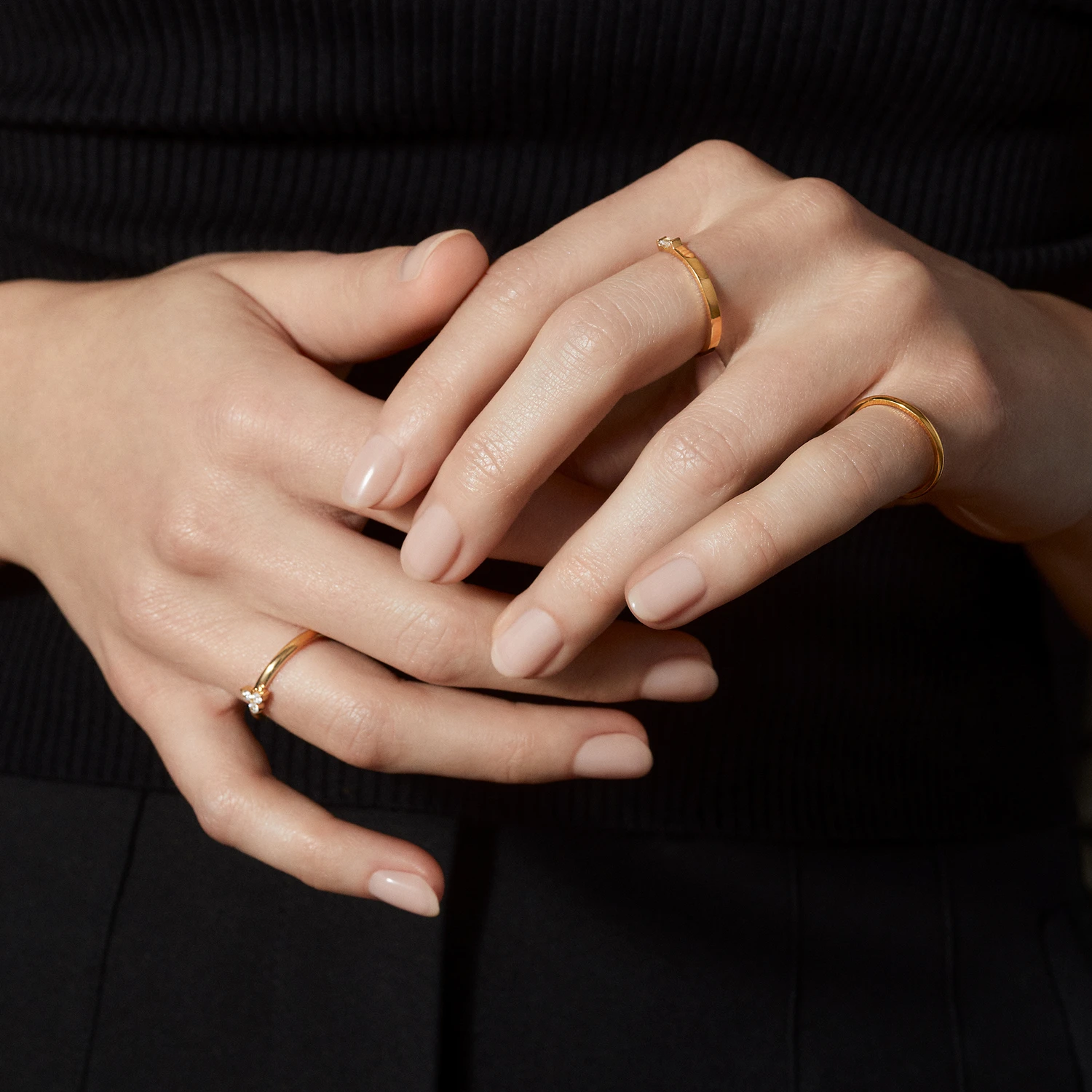
In the below image from Mia, a jewelry store, you can see the model is subtly pointing her fingers to the rings. This positioning helps you see what the ring looks like when someone is wearing it, and the position of her fingers directs your eye to the rings.

Apply a ghost mannequin to flat apparel photos
Ghost mannequins bring life and shape to your products. This is especially true for apparel and accessories, because oftentimes, customers want to see what the item will look like when they’re wearing it (how it fits, sits, falls, etc.) This context provides customers with the next best option to seeing the item on a person.
Added benefits of ghost mannequins are convenience and cost. They’re a lot more affordable to hire than live models, not to mention easier to coordinate with.
Below are two images of shirts, one with a ghost mannequin and the other without. You’ll notice the former provides more context as to how the long-sleeved shirt fits and how long it is.

You can see how a ghosted mannequin product photo compares to a flat product photo. It really puts some depth to the image as well as provides the customer some context as to the style and shape of the item.
Add a contextual background
Contextual backgrounds are another way to show your product in the wild.
We don’t necessarily mean in a forest or the jungle, unless that’s where your product is best suited. What we mean is your product’s proper environment, where customers can get a sense of how it ties into their lives. In fact, 37% of online shoppers want to see your products contextually.
Here are some examples of contextual background ideas:
- A toaster on a kitchen counter
- Books next to a cup of tea
- Decorative pillows on a couch
- Beach chairs on the sand
- People wearing dresses and jewelry at a party
Contextual backgrounds give your prospective customers a way to see themselves using your product.
A contextual background can also provide a sense of scale for customers to get a better idea of size in relation to other items.
Lifestyle elements also help customers envision themselves using the product in real life. Dimensions in the form of measurements can be difficult to envision. Sometimes you need context to give products scale.
Contextual backgrounds can highlight specific product features. For example, the Sony speaker below is waterproof, so showing it near a pool implies you can bring it near water without worrying.

Showing can be better than telling. So when it comes to your products, show customers what they can expect and how they can use your products. Descriptions are still really important, but visuals will make much more of an impact.
Fix every little imperfection
Most, if not all, ecommerce sites offer some zoom features — be it hover, click-to-zoom, or close-up shots. The ability to zoom in allows customers to see fine product details. So it’s important to ensure your photos are near perfect.
What’s more, Baymard’s research shows that 25% of ecommerce sites photos aren’t zoomable. Not surprisingly, “during testing, both low-quality images and images that couldn’t be zoomed sufficiently to see product details were a cause of product abandonments.”
Swarovski, for example, allows customers to zoom in on the products. Because their jewelry is very detailed, this is a great way for customers shopping online to see for themselves.
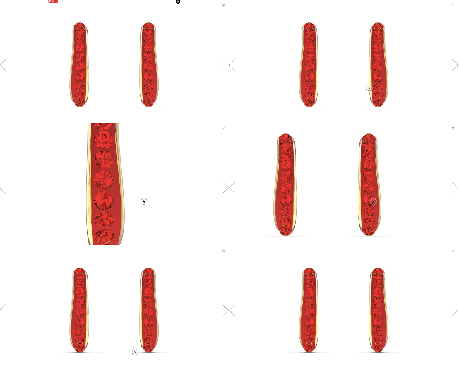
In post-processing, you’ll want to fix spots and blemishes and remove distractions like dust. This is especially necessary if your site has a zoom feature since imperfections will definitely show up.
As such, be wary of automated photo-editing software. It can miss important details that can make or break a sale. Our professional designers, for example, zoom in as much as 300% to make sure every edit is carefully executed to perfection. No shortcuts or automations here.
Make models smile
If it fits your brand aesthetic, consider featuring happy, smiling people with your products. This visual indicator shows potential customers how they, too, can be happy if they have that product in their life.
And for merchants, this could mean more orders. One Collectorz.com A/B test shows that when models smile, sales increased by 10%.
 Before |
|
Activewear brand Rec Room features lots of smiling models in their product photos. Shoppers get the impression that the clothing will bring comfort and happiness to their own lives.

But sometimes when you cull your shots it’s hard to choose the best. Maybe the model looks great in one photo but you don’t like the way the product is presented. And in another, you might love the way the product looks but it was an off moment for your model. In the latter scenario, you can literally Photoshop a smile onto your model. We’ve put together a tutorial to show you how.
Shoot from different angles, then crop and zoom
The recurring theme is to help your customers make informed decisions while shopping online, so taking photos from different angles will certainly help. In the real world, we don’t look at things from a single perspective. We move around, so we see things from different angles. Likewise, it’s important to display product photos taken from all angles. These perspectives also give people a better sense of scale and view of different details.
When it comes to bags, purses, wallets, luggage, suitcases, you should photograph the inside to show how things can be organized, so think about the pockets, compartments, zippers, clasps, and other details.
These ankle boots from Aldo Shoes show multiple angles so customers can see what they look like from the front, back, and side as well as detailed shots for features like stitching and the overall finishing.

When it comes to electronics, furniture and appliances, for example, you want to show dimensions and real life usage as well. This can help customers visualize the usage of your products, similar to the Sony speaker example above.
Or maybe your product is a flower arrangement. Showing it from the top down as well as the side is a good indication of the final product they’ll receive.
Reduce the image file size
Larger images affect load time on websites, and consumers have gotten used to fast loading websites. Google research has shown that load time affects your bounce rate (the rate of visitors leaving your site). As your page load time goes from one second to 10 seconds, bounce rate goes up a whole 123%.
And according to Crazy Egg, a single second delay in loading your website can affect your stats as much as 11% fewer page views, 16% decrease in customer satisfaction, and a 7% loss in conversions (aka sales). Yikes.

Decreasing your image sizes will help speed up your load times — especially true for sites with many images, like ecommerce.
Ideally, as the merchant, you want large images in dimension but not size (aka easy to see and zoom in, but also fast to download). Essentially, this means the image quality goes down a bit, but not significantly enough to be visibly noticeable.
There are lots of sites that can reduce image size without sacrificing quality or dimensions. Your load times won’t lag and your customers will still get the best quality photos of your products. It’s a win-win.
How will your product photography impact your ecommerce business?
If it’s not already, your product photography should be one of the biggest priorities for your ecommerce business.
These photos act as a best alternative shopping in person and help customers decide whether to purchase your product(s) or not. Don’t leave their decisions up to chance or factors you can easily prevent.

 After
After
